Books, the idea, cont’d: Penguin-style
Posted Under: The Designed Life
Douglas Coupland:
Last month I installed new bookshelves in a room in my house. They’re black, and my painter offered the unsolicited opinion that they might look depressing when completed. I knew he was wrong because, at the very least, the paperback shelf couldn’t help but have a cheerful orange zing a zing that comes from the Penguin spine, the most wonderfully insidious default interior design statement in our culture.
Of course he’s not simply expressing this opinion in public; it’s part of “A Penguin 75th Anniversary Project By Douglas Coupland.” (Is it just me or has “project” become the trendy word of the moment? Everybody is working a “project” now. Or several “projects.”) This is essentially an appreciation of Penguin cover design, which deserves appreciation: It is, in fact, iconic.
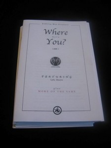
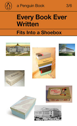
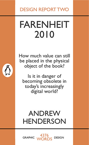
The project, as I understand it, is to use this graphic form (the Penguin cover) as template through which to “speak to the past.” He asks: “How would you speak to someone in the year 1935 from 2010 using a Penguin cover?” Coupland’s answers are here; templates can be downloaded here and people who have done so have added their creations to this Flickr set.
To be honest, I wasn’t really that impressed with any of the results so far. But one of Coupland’s examples (above) caught my eye, and one of the “crowd” submissions (below) caught my eye, and seemed relevant to this series. And, again, I really do think Penguin’s design style is iconic.


 "
"










 Kim Fellner's book
  A
A