Look and feel, and customers and readers
Posted Under: The Designed Life
The January 2010 issue of The Believer has an interesting book review — interesting in that the reviewer, Justin Taylor, was prevented from knowing anything about the book: who wrote it, who published it, to what genre it belonged, etc. “Its covers, front matter, and endpages had all been stripped, and the spine blacked out with a Sharpie.”
Toward the end of the review, Taylor addresses the “sensory-deprivation school of reading” he’d just experienced:
Jacket copy does more than simply entice you to buy. It supplies a framework for one’s experience. It is less a movie trailer than a placard on a museum wall, telling you not just how to look at the painting, but what to see there when you do.
I think that’s a very good point. Taylor adds some positive words about being a reader “freed from the tyranny of the preprogrammed response.” That’s an interesting notion, too.
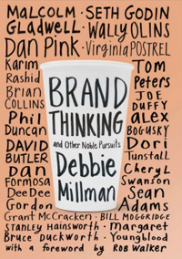
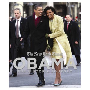
That said, physical books will continue to have covers, front matter, blurbs, and other elements of the “framework” Talyor describes. In my (limited) experience, publishers do think of these things as something like a movie trailer or advertisement. That is, they think about the cover design and title and so on in terms of potential readers: How to attract them, get their attention, hook them, reel them in. Will a shorter subtitle grab more people? What snappy language on the flap is most likely to lead to a sale? Is the cover bold enough to stand out from the pile at Barnes & Noble? Etc.
I wonder how these things might be different if they were created with actual readers in mind: Not the person wandering through the bookstore, but the person who has bought the book and is reading it. Would this affect the look of the book, the nature of the jacket copy, maybe even its title? Would the “framework” have more to do with reinforcing (or even influencing) the reading experience, and less to do with the point -of-sale experience? (To use/abuse Taylor’s terms, if these things were thought of more as a placard in a museum and less as a blaring moving trailer.)
Maybe there would be less difference than I assume. But it might be an interesting experiment or design assignment, to think about how a book would look, and how its jacket copy etc., would read, if it were crafted not for the potential buyer, but for the actual reader.


 "
"







 Kim Fellner's book
  A
A
Reader Comments
Rob,
I think there would be a substantial difference. This strikes at the heart of what is rotten beneath so much marketing: the ‘messaging’ doesn’t die. We remember. Once I’ve received the hook and the transaction completed, we do not forget the pitch. That is, now that book is sitting on my bookshelf and all the yelling on the cover is deafening. I’m annoyed now. Rip off the jacket, I can hear the crowd say. Sure: but is the rotten really gone?
There is a build-up effect here. How you sell a product lives on beyond the transaction and I think recognition of this, somewhere and somehow, would be refreshing.
Really enjoyed your interview in Objectified. Indeed, you were the embodiment of what I mean when I write ‘refreshing.’ In any case, it’s how I discovered you & your writing.
Best,
Ant.