


 "
"
Further thoughts on aesthetics
Posted Under: "Good Design" (Tyranny of)

I’m not sure why I got invited to this event above, and of course I didn’t go. But I’ve hung onto the email invite because of the way it looks. Aside from the recent posts here about the aesthetics of Asics sneakers and YouTube embeds, a couple of months ago there was an interesting discussion on this site here and here about MySpace aesthetics — specifically about why it is that MySpace seems popular despite such unpleasing aesthetics. (After all, aesthetics are supposed to matter today, etc.).
This invite, reminded me of that a bit.
When we lived in New Orleans in the early 2000s, when the whole Cash Money thing was really huge, I was always fascinated by the Cash Money aesthetic. Here are some Hot Boys covers, for instance.
Hideous! And yet … a pretty distinct graphic identity, no?
I’m not expecting any design-crit mag or site to delve into the Cash Money aesthetic and tell us its history, and who are its Peter Savilles and Stephan Sagmiesters — or even its David Carson. (Although I would sure read it, and I wish such pubs would assign articles like that.) But couldn’t one make the case that this isn’t an aesthetic mess at all, but rather a coherent visual language?
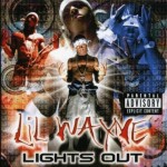
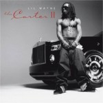
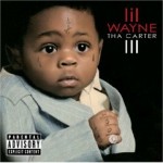
As a footnote, despite the recent party invite, interesting to note the way Lil Waye’s album covers have evolved, graphically speaking (left to right: 1999, 2005, 2008):


 Kim Fellner's book
Reader Comments
Danah Boyd wrote a big piece on the difference between Facebook/Myspace users’ demographic trends, and there’s a quote in it: “I suspect that lifestyles have aesthetic values and that these are being reproduced on MySpace and Facebook.”
Perhaps what we think of as supposedly default reactions to visual composition–“this is beautiful, this is horrible”–aren’t 100% really our own, but to a great extent determined by the aesthetics of our lifestyle/background, for which there is no default.
Yes, I think so. That’s exactly what I”m trying to get at.
Sorry Rob, I don’t see any evolution in Lil Wayne’s cover art/design at all. In fact due to the overkill use of using the same tried technique of having one single central figure as the focal point – over and over and over again – his cover art/design is very repetitve and boring. Despite the visual supporting cast changing in ‘volume’ from cover to cover – the design theory remains the same.
Ergo …yawn.
Visual communication either works or it doesn’t. Personal experience terms such as ‘beautiful’ or ‘hideous’ are superficial, and therefore completely irrelevent.
Neil,
If your URL anything to go by, you’ve probably forgotten more about graphic design than I’ll ever know (though the URL does seem dead), but I have to disagree with you. No evolution at in the cover art / design? Really? I understand your point about the single central figure, but surely the other design elements must have some relevance too.
I’m not a Lil Wayne aficionado, but there seems a clear evolution in his aesthetic. Now, that evolution may not be original, but it is there. I’d be surprised if his popularity would have increased as it has if his album covers still looked the same as they did in 1999. He’s changed, his fans have changed and the world we live in has changed. His album covers reflect that.
Neil: Hm, I must have done something wrong here. I meant to suggest that Lil Wayne’s covers have moved away from the cash money visual style, to more traditional designs. (Although I guess Rick sees what I was saying).
I’m not sure I’m following the distinction between “beautiful/hideous” being “irrelevant,” but at the same time dismissing his covers with a “yawn.” Again I may have just done a bad job with the post — my point was “hideous” was my reaction, not a judgment. (Two different things, right?) And that despite my reaction, the visual communication of the cash money style did work, in a way.
Anyway, I’m not a design critic or an expert, like I guess Danah Boyd is, or as you (Neil) might be, so, I was just thinking out loud here, again trying to get at the point that jenka mentions above.
Oh I have a killer example that personifies jenka’s thoughts above. Of course as a practicing graphic designer I’m always looking for the best and worst examples of type usage and graphic composition. Check out this link to a photo I took of a Ladies Night at the local VFW in Minneapolis.
http://www.flickr.com/photos/ooni/2737028790/
Hideous right? Oddly enough its almost so hideous by way of its use of only Microsoft Word Art effects and clip art that it crosses over to curiously awesome. I guess what I see in it is a complete lack of functional knowledge about how to communicate effectively, but also passionate individual despite the odds is proud they create this glorious piece of trash.
To me the Lil Wayne invite says two year tech college graduate, who thinks to literally as far as developing a concept goes. His audience is definitely not the wispy thin, Helvetica loving, modernist, art going crowd group vs. the anything that glitters(in this case, the type) is tight crowd.
The compensation also stinks of a $20 bar tab and a hundie thrown in for the flyer.
the covers for no limit records (which i think were before the cash money ones) were CLASSIC – especially the full-page spreads in the source…i wonder if pen & pixel is still around…in h-town back in the day EVERYONE was using that aesthetic…
oh yea theyre still around (http://www.penandpixel.com/) and still bringing the HEAAAT
As Peter says, this style derives pretty much straight from Pen & Pixel. Gooddoctorzeus wrote a great retrospective of them over on his site. It’s really insightful and the founder of Pen & Pixel actually came by and provided some background on the pieces they did for so many hip-hop artists.
That can be found here: http://gooddoctorzeus.blogspot.com/2008/04/pen-pixel-retrospect.html
Thanks Rob, for chiding me about e-mailing this to you instead of putting it up here.