I’m not at SXSW. And thus I’m rather surprised to have just encountered a Twitter hashtag, #unconsumption, tied to a panel, or maybe a presentation, that evidently occurred as part of that event, today. This was news to me! I looked it up and the panel is described here. The “organizer” is someone named Nita Rollins, who works for something called Resource Interactive. The summary given:
“Buy one, give one” isn’t a campaign for charity. It’s one facet of the massive values correction that recession-rewired consumers are making. Learn how the digital channel is driving the trend in consumer goods’ reuse and repurposing, and why brands should embrace unconsumption for both CSR and ecommerce initiatives.
People can do what they want, I guess, but I should probably go on record as saying that it sounds to me like this version of “unconsumption” has nothing to do with the Unconsumption project that I’m involved in. (You, or anybody planning to title a talk or panel with the word, can just Google “unconsumption” if you want more information about my claim on this concept.)
My view, for the record, is that brands can’t “embrace unconsumption.” The last thing in the world that I had in mind with the Unconsumption project was coming up with some sort of shorthand that would help companies move more newly manufactured branded units. The unconsumption idea isn’t meant for brands, or people who make a living by burnishing brands.
It’s meant for the rest of us.
Please check out the Unconsumption Tumblr for more, and consider contributing to the Unconsumption Wiki. Regarding the latter, it would be really great if it turned out that whoever this person is who gave a presentation all about unconsumption used the opportunity to promote this collaborative effort that could become a very useful resource to consumers, and prove beneficial to the greater good in the process. If that’s what happened, I’ll sure let you know.
That is all.
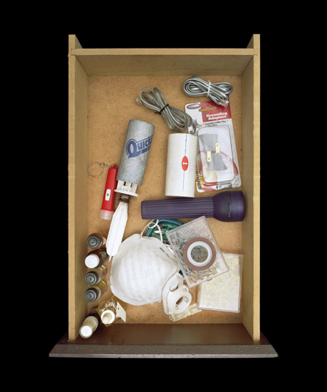
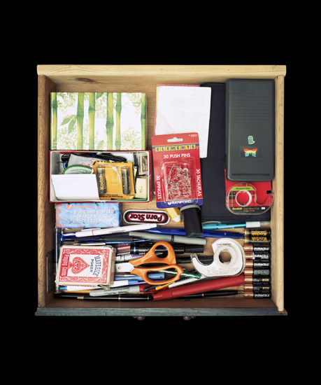
“Junk Drawers” by Paho Mann, via Junk Culture.
Posted Under:
Artists
This post was written by Rob Walker on March 13, 2010
Comments Off on More pictures of stuff
[Update: Some clarity on the credits thanks to a just-received comment.]

Robert The
Via this site.
Robert The (for Tobias Wong — see comments)
Via me.

Robert The (for Tobias Wong see comments)
Via this site.

Artist unknown. Unless you know. In which case speak up.
Via Hilobrow.
Flowers In May (click pic for more info)
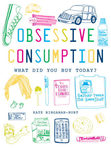
Kate Bingaman-Burt's book. (Click pic for details.)

Objectified Poster. (Click pic for details.)
Posted Under:
The Designed Life
This post was written by Rob Walker on March 12, 2010
Comments Off on Pictures of stuff, cont’d
I finally watched the Digital Nation episode of Frontline that I anticipated here earlier. It was okay. The thing I wanted to comment on was a very brief segment involving Feed Me, Bubbe, which is an online show that came about when a young guy basically decided to get his grandmother to be the star of this amusing little Web-based cooking program, on which they collaborate.
“I worked until I was 73. I worked for a bank,” Bubbe says, the point being that once she retired she didn’t have to do anything — but she also didn’t have much to do. “And then all of a sudden this kid walked in, and now I’m too busy!” The delight at this turn of events is evident in her voice.
The young guy then says: “The Internet, I have to say, added years to Bubbe’s life.”
No, sweetheart. You added years to Bubbe’s life. Listen to her version of things: “this kid walked in.” That’s you. Here again is the medium/message problem. The Internet is just something that came in handy, and that you made cunning use of. I suppose it’s possible that if the Internet hadn’t been there you wouldn’t have come up with anything. But I know for a fact that the Internet is there in millions of scenarios just like this, and nothing changes; bubbes everywhere remain under-appreciated, ignored, left lonely, and maybe even snickered at for not being tech-savvy. The Internet has no agency; individuals have agency. I don’t usually use the word “inspiration,” because it means so little these days, but there is a genuine one here, and it’s not the Internet. It’s you.

Click for details.
To go with the earlier book ring? (Thx: Susan C!)
Posted Under:
Things/Thinking
This post was written by Rob Walker on March 12, 2010
Comments Off on The idea of the book, continued
Friend of Murketing Rubi McGrory is rounding up foodstuffs “with logos built right in — when you eat the food, you eat the logo.”
This is in connection with an exhibition here in Savannah.
Examples:
Sweet Foods
- M&Ms
- Oreos
- Jelly Belly
- Sweet Tarts
- Lorna Doons
Not sweet Foods
- Carrs crackers
- Goldfish (the food is the logo)
- Chex mix (again, the food is the logo)
More savory examples particularly needed.
Thoughts? Please ask around! Answer below or on Rubi’s blog.
Thank you, brilliant and generous people!
Since the destruction of books and/or use of books as sort of raw material to build something else, has been a theme of some recent posts, here are some different sorts of visual approaches to the idea of the (https://comfortdentalcareofbrookline.com/ativan-2-5mg-lorazepam-online/) book:

Mickey Smith / click pic for more.
Via Junk Culture: “The act of hunting for and photographing bound periodicals and journals is fundamental to Mickey Smith‘s process. She does not touch, light, or manipulate the books and words – preferring to document them as found in the stacks, created by the librarian, and positioned by the last unknown reader.”

Abelardo Morell / click pic for more.
And E has reminded me of this series by Abelardo Morell.
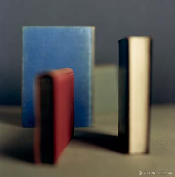
Victor Schrager / click pic for more.
… as well as this one by Victor Shrager.
Finally, while randomly poking around on this a little more I encountered, via this site, the “Sorted Books” project by Nina Katchadourian. “The process is the same in every case: culling through a collection of books, pulling particular titles, and eventually grouping the books into clusters so that the titles can be read in sequence, from top to bottom.” To wit:
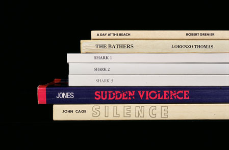
Nina Katchadourian / click pic for more.
Posted Under:
Artists
This post was written by Rob Walker on March 11, 2010
Comments Off on The idea of the book, continued some more.
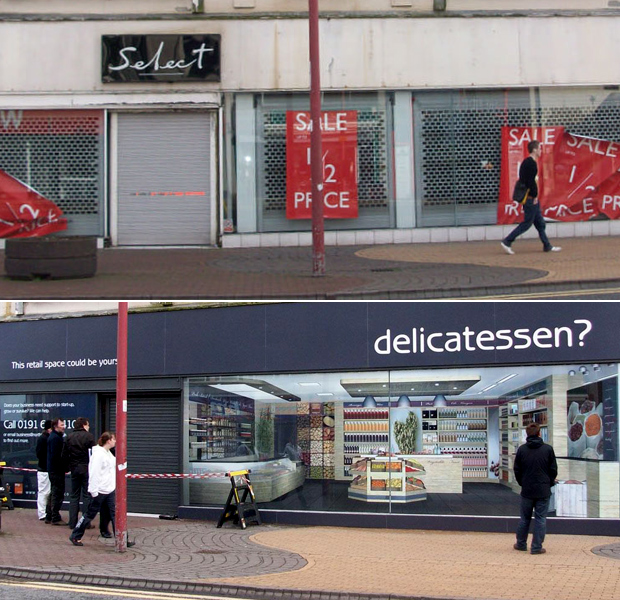
Via PSFK: This brief report on the installation of fake storefronts to make downtown Tynesdale look less moribund than it really is. I’ve been trying to find more/better images, but I’m now giving up. My Google-fu and and Flickr-fu are inadequate, I guess; if you can help let me know.
Meanwhile, here’s my idea for the Tynesdale City Council: Make T-shirts advertising these hypothetical businesses. A nice minimalist slate-gray T with the “delicatessen?” on it could be good.
Also: In my last imaginary brand roundup I forgot to include the below development noted by Gladys Santiago:
If you’ve seen the Filet-O-Fish commercial McDonald’s airs for Lent, then you’re familiar with “Frankie the Fish” and his infectious jingle. Not being one to miss an opportunity to capitalize on kitschy sentimentality, McDonald’s has released a “Frankie the Fish” novelty frame that was obviously inspired by pop culture sensation, Big Mouth Billy Bass.
Here it is:
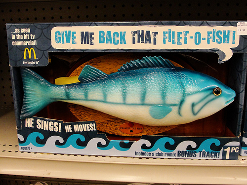
I guess this isn’t “imaginary,” but it’s pretty meta:
Ad campaign “riffs on” (e.g., swipes) a pop-culture-sensation product of the recent past; converts it into a commercial icon; and then takes it to retail, where the packaging continues to deliver the sell (“give me back that filet-o-fish,” which I gather is what the object actually sings) and in fact to tout the item’s tv-ad provenance.
That’s $29.98 at Taylor Gifts.
Posted Under:
Imaginary Brands,
Murketing
This post was written by Rob Walker on March 10, 2010
Comments Off on Imaginary brand variations

A bit late on this, but over the weekend Virginia Heffernan’s column was a consideration of physical books by a professed ebook fan. Jumping from Walter Benjamin’s “Unpacking My Library: A Talk About Book Collecting,” which rhapsodizes about the the amassing even of books you never read, she writes:
If he says not reading books can be as sophisticated and European as reading them, I believe him, and I will try to think of my books as Sèvres china. But Sèvres china, if I had any, would be for display on its days off, wouldn’t it? So how do I display or otherwise admire all these books I keep buying for the Kindle?
Unpacking my Kindle library, I click “menu” on my screen and find . . . a list. First, the words “The Happiness Project,” the title of a book by Gretchen Rubin, in stout dark gray lettering, underscored by a lighter, less stout line.
This might be depressing. I can’t tell if I’m supposed to consider this underlined title to be the “book” I ordered from Amazon. Maybe it’s more like a catalog listing. If I click on it, I’ll get to the words in the book. Maybe it’s analogous to a book’s spine.
I want to rhapsodize, as Benjamin does, when he remembers the tactics he employed to acquire the book “Fragmente aus dem Nachlass eines jungen Physikers” (Johann Wilhelm Ritter, 1810) after a Berlin auction. But the only memory I have of purchasing “The Happiness Project” is no memory at all….
Read the rest here. It’s interesting. See also if you missed it the Murketing post on book spines as wallpaper, here.
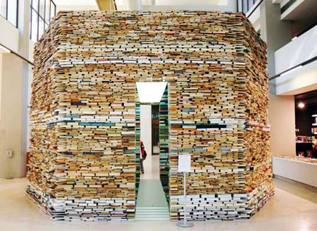
On a slightly related note, I offered some examples a while back of artists and designers making things out of books in a post on Significant Objects. Two more examples here: the one above by Paul Octavious, via SwissMiss, and the other by Matej Kren, below, via Book Of Joe.
The awards will be given for writing that demonstrates the greatest evidence of eloquence, analysis, perspective, insight and original thinking to further a public understanding of design in contemporary culture. Writing that advances the visual expression of a design program, argument or thesis is also eligible. Entries may address any design discipline or form, including, but not limited to: architectural, environmental, fashion, graphic, industrial, information, interactive, product and strategic.
More details here. Deadline June 1. Top award $10,000.
$10,000!
The jury is Jessica Helfand, Paola Antonelli, Steven Heller, and … um, me.
Posted Under:
The Designed Life
This post was written by Rob Walker on March 9, 2010
Comments Off on Winterhouse Writing Awards taking entries
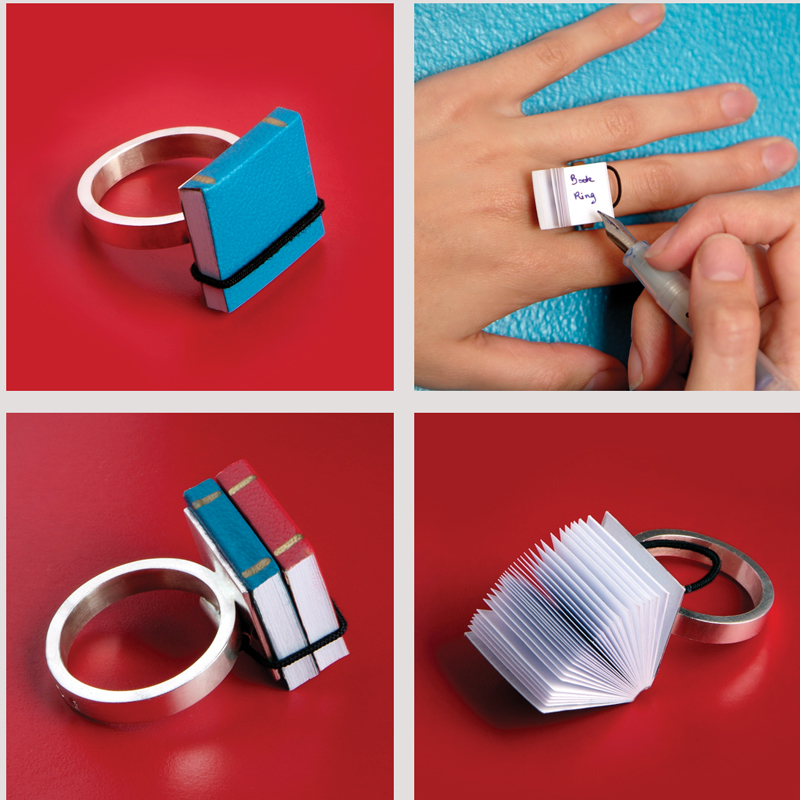
This is the Book Ring, from Ana Cardim. Just a quasi-related follow to this post.
Posted Under:
Just Looking
This post was written by Rob Walker on March 6, 2010
Comments Off on The idea of the book, continued…
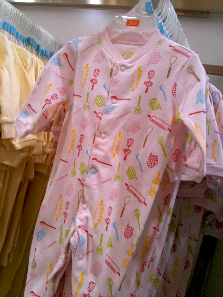
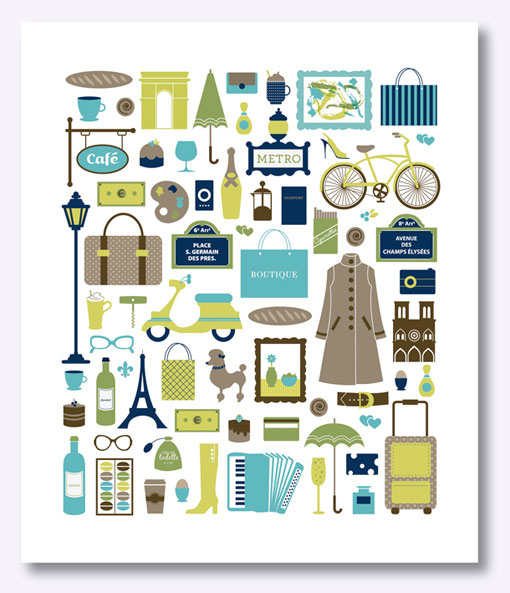
Here we have pictures (okay, drawings) of stuff as a design motif. What does this stuff communicate? Sociological Images, from which I have stolen this image, comments: “Just a reminder: being a girl means wearing pink and thematically attiring yourself in cooking and baking implements!”
Book-walls are just aesthetic now, just an unusually dense wallpaper: We don’t really need them for consultation. I can probably find the complete text of most of them online within an hour.
That’s from a Globe & Mail essay, A Lament For The Bookshelf. And of course when I read it I thought: Now there‘s an idea — a book-spine wallpaper pattern! [IMPORTANT UPDATE: Please see after the jump — it exists! Sort of!]
I can easily imagine a variety of choices for different consumer segments, based on what identity each one wants to project. Old-school classics? Dense philosophy? Hip contemporary fiction? Art tomes? Hilariously ironic “bad” books? Etc.
Or how about this: A flat screen that hangs on the wall and is about the size of a bookshelf, or even a book case, that displays a rotating assortment of book spines? It could be tied to what’s actually in your Kindle or whatever, or it could be a complete fantasy. There could be a subscription service so your virtual shelf is always displaying whatever got the best (https://www.maulanakarenga.org/ativan-lorazepam-online/) reviews in the Times in the past few months.
Moreover, the book spines don’t even have to be photorealistic, they could be executed in various visual styles, like this. Or, again, a subscription service so a different artist rendered the idea of the books you would like have on display, if you actually had a bookshelf.
C’mon. That could xanax happen.
[Update: Or has it happened already? More after the jump.]
Read more
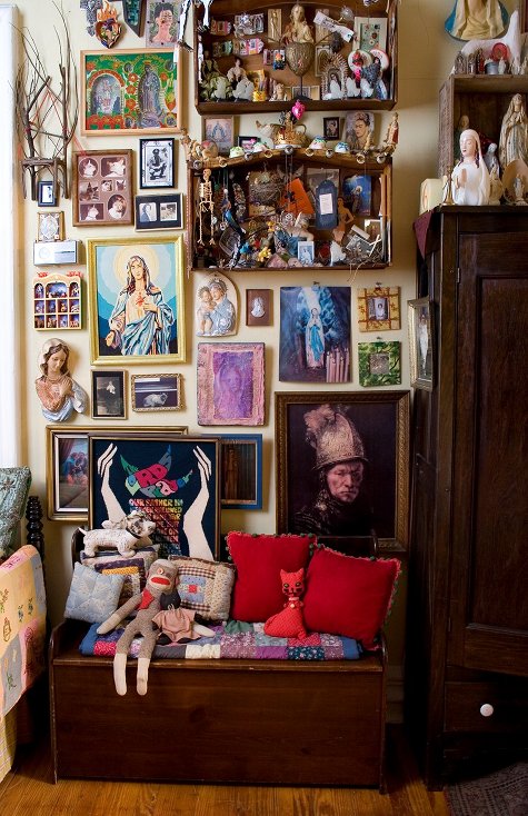
Click the pic to see more on Design*Sponge
When Unhappy Hipsters started making the rounds, I linked to it from the Consumed Facebook page, where Braulio alerted me (thanks again) to this Psychology Today column by Ingrid Fetell, asking: “Are there elements of modern design that inherently make us feel gloomy?” Her answer klonopin is that, in fact, there might be.
Modern design was born out of a desire to leave (https://www.pawsgistclinic.org.uk/stromectol-ivermectin/) behind the ornamentation and excesses of 19th century Europe. In essence, it’s a stripped back, pared down style of design, favoring clean, often angular lines, neutral colors in tones of gray and beige, bare materials, and a general sense of spareness and minimalism….
She’s generalizing, of course, and at first that doesn’t sound so bad. But then she notes research on emotional responses to color, and angular vs. curved forms. The short summary would be that many of the tropes of “modern” design are at odds with good vibes. “I think,” she writes, “that modernism’s restrained quality is fundamentally in tension with the idea of delight. Delight is an emotion of abundance — a celebration of sensation and richness. Delight and joy are primally connected to wellness, and wellness in nature is lush, plump, vibrant, and bountiful.” (Fetell also has a project/blog called Aesthetics of Joy, here.)
I am somewhat cautious about that connection between delight and abundance. Buying into that idea full-on would be emotionally catastrophic — I mean, maybe those “hipsters” are unhappy, but watch an episode of Hoarders and decide for yourself how delightful that abundance seems.
But on some level I think Fetell has a point. Just yesterday I was browsing Design*Sponge and I was struck by the “sneak peek” pictures of Michael Quinn’s apartment. (Two examples, above and below.) I wrote here earlier about how much I enjoy D*S’s “sneak peek” series pictures: “They’re interesting because they’re so unlike the spare and clinical celexa interiors often featured in more mainstream Design Think contexts, such as certain shelter magazines (not to mention catalogs) and the like, where the decor is always minimal, and there’s no clutter beyond one or two art books.”
Misgivings aside, then, I’d still rather look at these pictures than what I see celebrated in most sharp-and-clean-focused “good design” sources.
The combination of Fetell’s piece and these D*S images actually brought to mind a number of topics I’ve pondered here in the past — the visual jumble of MySpace, the more recent post about groups of stuff, and of course the significance of otherwise-oddball-seeming-objects.
What do you think? Is clean, spare design a bummer? Is the notion of clutter-abundance delightful — or a rationale that dead ends unpleasantly?
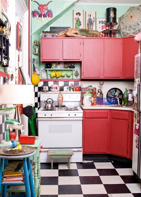
Click the pic to see more on Design*Sponge


 "
"




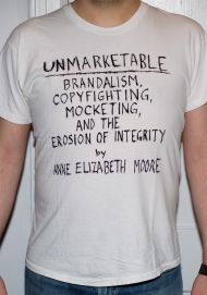
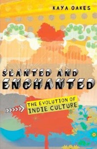
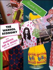
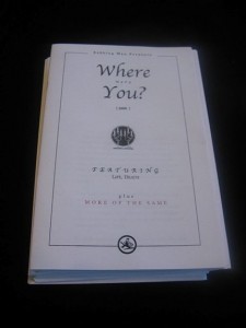
 Kim Fellner's book
  A
A