- LUST: An Exercise in Non-Branding: The new issue of Print has a very interesting article about dope packaging — I mean dope like marijuana, not dope like awesome — by friend of Murketing James Gaddy. Here’s a kind of adjunct on the newly redesigned Printmag.com. But pick up the issue, Print’s been really good lately.
- Can you lend me a Joseph Beuys artwork?: “More specifically, can you (or someone you know) lend me the parts for it? I am working on a project for PS1 that re-creates Joseph Beuys’ famous “Sled” work from 1969, but using all objects BORROWED from my friends and extended social network.” Click through for details from Stephanie Syjuco.
- Metal Boot | Significant Objects: “Yet the men Wheat led to war were — very curious to say — his own sworn enemies.” Story by Bruce Sterling.
- Foppish Figurine | Significant Objects: “A compassionate civil rights activist, he was also a bodybuilder who delighted in beating up hippies.” Story by Rob Baedeker.
Posted Under:
Non-Daily Linkpile
This post was written by Rob Walker on July 31, 2009
Comments Off on Linkpile
Posted Under:
Non-Daily Linkpile
This post was written by Rob Walker on July 29, 2009
Comments Off on Linkpile
Posted Under:
Non-Daily Linkpile
This post was written by Rob Walker on July 27, 2009
Comments Off on Linkpile

 MARKETING POSE:
Saulting the sun in a downward-dog economy
For its first fiscal quarter of 2009, the chain Lululemon Athletica reported that consumers spent $81.7 million in its stores, which represented a slight increase over the same period in 2008. What were shoppers buying? “Yoga-inspired athletic apparel” is how the company describes its wares. This includes specifically yoga-related gear like mats. But it also includes items whose connection to the practice of yoga is harder to parse: bags, jackets, dresses, even hats….
Read the column in the July 26, 2009, New York Times Magazine, or here.
Discuss, make fun of, or praise this column to the skies at the Consumed Facebook page.
Posted Under:
Consumed
This post was written by Rob Walker on July 25, 2009
Comments Off on In The New York Times Magazine: Lululemon
Probably my favorite thing to look at on Design*Sponge is anything in the “sneak peek” category: Images of the homes or work spaces of Design*Sponge-ish creators and retailers and so on. They’re interesting because they’re so unlike the spare and clinical interiors often featured in more mainstream Design Think contexts, such as certain shelter magazines (not to mention catalogs) and the like, where the decor is always minimal, and there’s no clutter beyond one or two art books. In contrast, the spaces documented in these Design*Sponge photo-posts are often full of colorful clutter; the walls aren’t empty and white, they’re jammed with images. They’re rarely minimal.
 There’s nothing wrong a with a spare interior, and the clean-and-white look has its charms. But it very rarely seems lived-in. Whereas the D*S spaces do (even if the owners no doubt cleaned and straightened before offering documentation to a Web audience).
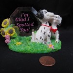
I’ve been thinking about this again lately because of the Significant Objects project. I doubt any of our objects could, on aesthetic terms alone, be singled out as worthy design. And yet I can easily imagine the Golf Ball Piggy Bank, or even the Spotted Dogs, in one of these D*S settings. Not for aesthetic reasons, but for narrative ones. There’s no shortage of mysterious and interesting objects in those picture-posts that always make me wonder: What’s the story with that thing? And you know there’s a story; that’s really why the objects are there.
 Now you could point out that the bric-a-brac that pops up in the D*S pictures has stories that come from their owners lives’, whereas our Significant Objects have stories that come from the imaginations of our contributing writers. Then again, the people who have been buying the Significant Objects aren’t simply accepting a story someone else has created — they are adding that story to their own story. When somebody asks, “What’s with that golf ball bank?” or “What’s with that weird dog sculpture?” the the owner is not likely to merely recite what Todd Pruzan or Curtis Sittenfeld wrote, though they may incorporate that into the tale of learning about Significant Objects and deciding to get involved and so on and so forth. It’ll be a great story, actually.
And as I’ve said before, elsewhere, that’s really where the meaning of things comes from: us. That’s why I wonder as I do when I look at some of those D*S “sneak peek” images — I wonder about peoples’ stories intersecting with stuff.
Oh, and speaking of S.O.: Today’s story is now up: A duck tray + story by Stewart O’Nan.
Posted Under:
Things/Thinking
This post was written by Rob Walker on July 24, 2009
Comments Off on Significant Clutter
Posted Under:
Non-Daily Linkpile
This post was written by Rob Walker on July 24, 2009
Comments Off on Linkpile
- Ghostly Discovery iPhone Application: Coolhunting: “Ever ahead of the music industry curve, Ghostly International today released its first (100% free) iPhone application, Ghostly Discovery, a slick listening app that uses mood-based tagging to generate playlists from the Ghostly International and Spectral Sound (its dancefloor-oriented arm) catalogues.” Archival Murketing Q&A with Ghostly founder here.
- Numberizing Walter Cronkite “trust.”: “Cronkite first became synonymous with trust in 1972, when the Oliver Quayle and Co. poll included his name in a list of public figures to determine a “trust index.” Cronkite topped the rankings with 73 percent, which seemed impressive until you considered the skunks polled alongside him. The “average senator” scored 67 percent in the survey, and President Richard Nixon—easily the least trustworthy animal ever to walk on two legs—received 57 percent, as did Hubert Humphrey.” Jack Shafer piece has interesting stuff in it.
- Spotted Dogs Figurine | Significant Objects: Story by Curtis Sittenfeld. “It’s not that I think I married the wrong man.” Nicely done.
Posted Under:
Non-Daily Linkpile
This post was written by Rob Walker on July 23, 2009
Comments Off on Linkpile
A little while ago I linked to what some say is the most amazing music video of the year. I agree: It’s impressive.
Today Kevin Kelly had an item about it, headline “Crowdsourced Music Video,” which linked to this interview with its creators. The interesting thing about this interview was the following question:
Most viewers recognized this as a professional effort, but it certainly made use of the amateur aesthetic and idea of collaboration. Where did the concept come from?
Actually, I take that back. The question (where did the concept come from?) isn’t interesting. What’s interesting is the phrase I’ve bolded, “the amateur aesthetic and the idea of collaboration.” It’s particularly interesting because despite this open acknowledgment that this video was not a product of amateurs, and the collaboration was more of an idea (that is, a whole bunch of people simply did what they were told) than a reality, it still evidently qualifies to some observers as an example of something that’s been “crowdsourced.”
If that’s the case — if the crowd’s job is basically to follow orders from well-funded visionary authorities (four directors, two of whom are “creatives” at the global ad agency BBH), and kinda look all crowdy-like while doing so — then what, exactly, does crowdsourcing mean?
Is it about amateurs, or about “the amateur aesthetic”?
Is it about collaboration, or about “the idea of collaboration”?
And given that I’ve just said I think the end result is a really great video, what difference does it make? Is this just a matter of people applying trendy words to something impressive, because the trendy words happen to encapsulate the the 2.0 dogma of the moment?
Posted Under:
Non-Daily Linkpile
This post was written by Rob Walker on July 20, 2009
Comments Off on Linkpile
- Consumers Don’t Hate Ads After All, Survey Claims: “67 percent agreed (14 percent strongly) that ‘By providing me with information, advertising allows me to make better consumer choices.'” Yeah? Via Consumerist.
- Three Keyboard Cat Moon: On Threadless (still being voted on.) Via BB.
- Brain wiring creates false memories: Study says those with more false memories “were found to have higher-quality neural connections, called axons, in the superior longitudinal fascicle, known to be associated with gist-based memory.”
- Admin. to review color-coded threat-level system: I missed this news, but E wised me up when I mentioned in passing I thought this system, though pretty much an information-design FAIL, would last for a long time, just out of inertia. Oddly this story says one reason is the “overall level of awareness … is greater now than it was before the attacks.” Eh? The system was introduced AFTER the attacks, and I can’t imagine anybody would argue that “awareness” is higher today than it was in the year or so after 9/11. One of the reasons the system is a failure is no one notices it anymore. It’s just signs at the airport that no one pays the slightest attention to.
- Nutcracker with Troll Hair (or something) | Significant Objects: Story by Adam Davies. “Desperate, Mr. Chavarria fashioned his own Mr. Yodels, ignorant of the necessary protocols.”
These links compiled via delicious, and repurposed here with plug-in Postalicious. Not enough stuff? Not the stuff you wanted? Try visiting unconsumption.tumblr.com, murketing.tumblr.com, and/or the Consumed Facebook page.
Posted Under:
Non-Daily Linkpile
This post was written by Rob Walker on July 19, 2009
Comments Off on Linkpile
Posted Under:
Flickr Artifacts
This post was written by Rob Walker on July 17, 2009
Comments Off on Flickr Interlude
Posted Under:
Non-Daily Linkpile
This post was written by Rob Walker on July 17, 2009
Comments Off on Linkpile
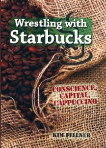
As you may have read, Starbucks is testing out the idea of removing the Starbucks name from some of its locations, remodeling and renaming them, so that they look more like neighborhood coffee places. A Starbucks brand honcho says the idea is to give these locations “a community personality.”
Insofar as these coffee shops remain, in reality, disguised outposts of a ubiquitous multinational, this is obviously a completely synthetic version of “community personality.” It’s reminiscent of the big breweries putting out new brands that look like craft beers, or mass-market clothing brands tweaking product lines to get the “handmade” look, among other examples. In this case it seems that Starbucks sent out some of their experts on this matters to sit around actual local coffee shops to take notes and crib ideas. One Seattle coffee shop owner, such visitors returned many times over the period of a year, toting “obnoxious folders that said ‘Observation.'”
Presumably such detailed ethnographic study is necessary, for the chain’s new indie-simulacrum locations to be sufficiently, you know, authentic.
Posted Under:
Non-Daily Linkpile
This post was written by Rob Walker on July 16, 2009
Comments Off on Linkpile
Posted Under:
Non-Daily Linkpile
This post was written by Rob Walker on July 14, 2009
Comments Off on Linkpile



 "
"

 MARKETING POSE:




 Kim Fellner's book
  A
A