The most enjoyable moment in the debut episode of Mad Men was — of course — the scene in which the advertising agency protagonists meet with their big tobacco-company client. It’s 1960, and becoming clear that tobacco companies aren’t going to be able use the rational-sounding sales pitches about how cigarettes are somehow good for you. Everyone’s has read in Reader’s Digest that the data just don’t back this up. What to do?
The meeting seems to be in a tailspin when Don, the slick-hair, gray-suit, main character of the show, asks the crusty old Southern tobacco magnate how his cigarettes are made. He latches onto a word in the man’s matter-of-fact description: Toasted. He writes it on a chalkboard: Lucky Strikes tobacco — It’s Toasted.
But, the magnate says, every brand is toasted. Then it sinks in. Here is what can replace the rational pitch — the meaningless pitch. Just put the phrase out there, and let the consumer fill in the blanks. Toasted? That sounds good. Must be good. Must be a point of differentiation — and a damn good one — if they mention it in their advertising.
None of this is spelled out, of course. But it’s a fair summation of a broad-brush shift that makes advertising today so different than it was in earlier eras. Read more
This is how most pop stars operate now: as brand-name corporations taking in revenue streams from publishing, touring, merchandising, advertising, ringtones, fashion, satellite radio gigs or whatever else their advisers can come up with. Rare indeed are holdouts like Bruce Springsteen who simply perform and record. The usual rationale is that hearing a U2 song in an iPod commercial or seeing Shakira’s face on a cellphone billboard will get listeners interested in the albums that these artists release every few years after much painstaking effort.
So writes Jon Pareles in the NYT today, in an article about the business of Prince. Who, he argues, fits the pattern in some ways, but is different many others. Still, he writes, Prince “doesn’t have to go multiplatinum — he’s multiplatform.”
Well said. What I wonder is how multiplatform models will get built in the future. Prince, U2, Sting, even Shakira and 50 Cent, owe a good chunk of their brand equity to old-style big record company mass market oriented tactics (the kind that resulted in multiplatinum sales) that seem to be increasingly incapable of building new pop stars of similar stature. Maybe the American Idol creations have some of that stature, but it’s not clear to me if it will be lasting, and in any case it’s hardly a pure grass roots thing.
Seems like stars who made their name in the “old days” (that is, anytime up to a few years ago) have a lasting advantage in the multiplatform marketplace.
In Consumed: Domo: How Internet jokes helped a Japanese ad mascot make its way into American malls.
This fall, the cable channel Nicktoons Network will begin showing a series of two-minute stop-motion animation shorts featuring a brown, squarish creature with arms and legs and a mouth permanently thrown wide open to reveal sharp white teeth. Like any other cute character on a kid-friendly TV show, this little fellow, whose name is Domo, is perfect for the crossover into licensed merchandise. What’s unusual about Domo, however, is that he arrived in the U.S. retail marketplace well ahead of his debut on American television. He’s on T-shirts and accessories at Hot Topic, greeting cards at many Barnes & Noble locations and grocery stores and is expected to be sold as a plush doll at F.Y.E. stores. Then again, Domo is a merchandisable star not so much because he has a TV show in the works but because of his track record in what is arguably the most potent entertainment form of our time: clowning around on the Internet….
Continue reading at the NYT site, or at the Boston Globe site.
Additional links: Domo Nation site, includes the original Domo films; Domo on Flickr; Domo on DeviantArt; Domo at Hot Topic; Domo/kitten image referenced in column.
Several months ago, I had to have some tests done at a hospital. (Don’t worry, this isn’t going to get distressingly personal.) I was billed $1,875.41. I have health insurance, which I pay for myself, as I am not on staff at The Times or anywhere else, Day Job notwithstanding. Because of some transition issues related to our move from New Jersey to Georgia, there was confusion about pre-existing conditions and all that, so there was a delay in determining whether I was on the hook for that amount, or for the amount that my insurance carrier “negotiated” with the hospital. The latter figure was $937.70.
So that’s not trivial. I would much rather write a check for $937.70, than for $1,875.41. Wouldn’t you?
I jumped through the various hoops. I ignored the bills and urgent letters from the hospital. Eventually, I got word from my insurance company that the lower rate they’d “negotiated” was now in effect. So I waited for the hospital to send me the new paperwork.
Today, I got a phone call. From the hospital. With a sense of dread, I returned the call. I explained the situation and asked the rep what I owed. She said $937.70. I was relieved, and said I was just waiting for the paperwork. According to her, it had been mailed weeks ago — but then she explained the reason the hospital was calling. The reason was this: If I would pay up right now, via phone, using a credit card, debit card, or (somehow) a check, then I would get a 30% discount.
I said: Okay. My cost at that point falls to $659.39. Done.
So. The hospital’s fee was $1,875.41. The insurer-negotiated rate was $937.70. But if I fork over $659.39 right now, we can all call it a day.
Is this hospital on the brink of bankruptcy? What is its business model? What is the true cost of my procedure? Is someone out there paying $1,875.41 for the same thing that cost me $659.39?
How dysfunctional is the health care business?
 Browsing recently in the Murketing.com library, I came up on a book called Brand New, by a Harvard Business School professor named Nancy F. Koehn, which came into my possession several years ago for reasons I’ve forgotten. I ended up reading a chapter about Heinz — the man, and the brand. Among other things, it answered for me a question I had wondered about before, which is what that “57 Varieties” promise on Heinz ketchup (and other products) refers to. I’ll get to that in a moment.
It turns out that Henry Heinz was a master of murketing. Sure he used traditional tactics like newspaper ads and streetcar placards and the like, as his company expanded from selling bottled horseradish and pickles to a wide range of processed foods and condiments from 1875 through the turn of the 20th century. But he also distributed lots of souvenirs through exhibits county fairs across the country —
 in particular, he gave away thousands and thousands of pickle pins.
“Pickle pins turned men, women and children into walking announcements of the Heinz brand and its most famous product,” Koehn writes. “In the modern language of service management, the Pittsburgh entrepreneur worked to enlist his customers as committed spokespeople or disciples for the company.” Her book is from 2001, so really the even more modern language would call these people consumer evangelists or brand ambassadors, or some such. Heinz himself was more straightforward at the time: Such tactics “let the public blow our horn.”
And the 57 Varieties? Here’s the deal. In 1896, when Heinz was 53, he was riding a train in New York and noticed a sign boasting about 12 shoe styles. His own account:
Counting up how many [products] we had, I counted well beyond 57, but ’57’ kept coming back into my mind. ‘Seven,’ ‘seven’ – there are so many illustrations of the psychological influences of that figure … that ’58 varieties’ or ’59 varieties’ did not appeal at all.
In other words: He made it up! The number 57 refers to nothing in particular, except maybe to Heinz’s hunch that “7” has some kind of “psychological influence” built into it. (See this for more on 7-ism.)
“Within weeks,” Koehn writes, “’57 Varieties’ was appearing everywhere — on billboards and product labels, as well as in major newspapers. Before long, the new slogan had been emblazoned in concrete on prominent hillsides along main rail routes.” Four years later, Heinz put up the first electric sign in Manhattan, a 1,200-bulber at the corner of 23rd and Fifth: “The sign was six stories high, with a forty-foot-long pickle bearing the Heinz name and the ’57 Varieties’ slogan.”
 I haven’t seen ads for Miller’s new beer, which is called Chill, but I’m guessing by the variety of venues that the brewing giant’s distribution machine is placing it in that they’re giving it a big push. Curiosity led me to a brief Google search, which landed on the Wikipedia entry. That reads in part:
After blowing through sales and distribution targets in … test markets, Miller announced on April 17, 2007 that Miller Chill will be available nationally. As of July 2007 the product is in full national distribution.
I know that marketers write Wikipedia entries for their clients’ products, but seriously, could this be any more transparently phony? Oh it blew through sales and distribution targets, did it? And how do you know that, you super-impressed Wikipedia contributor, you? Interesting that you would state this with such certainty — and yet not reveal either what those targets were, or what the sales were. Interesting also that the only two cited sources for the entry are both something called Brewblog, “Miller Brewing Company’s official blog.”
Actually there’s a “marketing” section in the entry:
Miller Chill’s marketing taps into the consumer trend of “Latinization” in the United States – the mix of contemporary American and Mexican cultures. This mix of cultural influences is played up throughout the beer’s advertising, created by Young & Rubicam Chicago. This is especially apparent in the playful use of Spanglish in its advertising, which positions the brand as the perfect refreshment for “wherever and whenever things get hot.”
Yeah, great job Y&R! That ad strategy sounds fantastic! You should send your clients this evidence of the grass-roots appreciation for your work!
Update (7/18): The Miller Chill entry on Wikipedia has been edited since this post went up. Thinking ahead, I have screen shots of what it said before some of the quoted material above was toned down. The quotes here were accurate when this was first posted.
I know I had an opinion, when I was a child, about whether Matchbox cars were better than Hot Wheels, or vice versa. Unfortunately, I can’t remember what that opinion was. Certainly I also don’t remember the kind of impressive details that apparently marked the original Matchbox models, as described today in the obituary of Jack Odell, who started making those tiny cars in the 1950s:
They were finely wrought things. Mr. Odell designed one machine to spray-paint tiny silver headlights on the models and another to mold interiors. All the dashboard dials were in precisely the right place. Some cars had more than 100 die-cast parts, including windshield wipers and ceiling hooks.
Sounds impressive. By the time I was flinging tiny cars across the kitchen floor, they were not nearly so fine. I assume those older, complicated models must be changing hands on eBay these days.
What is it about miniature replicas of cars, anyway? I don’t know what’s up with Matchbox and Hot Wheels these days, but I do know that interest in this general category of toy/collectible remains, and that it’s possible to buy miniature donks. Whether these items would live up to Odell’s standards is hard to say.
Posted Under:
Obituaries
This post was written by Rob Walker on July 17, 2007
Comments Off on 3 billion cars, 12,000 models
I recently noticed an ad agency advertising itself to potential clients by asking if their brands could pass “the T-shirt test.” Please. The T-shirt test is for also-rans and wimps. Can your brand pass the tattoo test? Joining the likes of Nike, Apple, and PBR, is none other than brand underground subject The Hundreds. That’s their bomb logo, inked forever into some loyal (and in my view crazy, no offense Ben & Bobby) consumer’s skin.
So, this is sort of what I had in mind when I suggested that the time has come for watches that don’t tell time. This is not a bracelet. It’s clearly a watch. Or rather, it is something that uses the watch form, to be a not-watch.
I’m personally not drawn to the gimmick of the giant word “NOW,” which strikes me as ham-handed design at best. Really, how many times could you wear this $50 item? It’s more of a gag than idea. (I’m also not a fan of these Hercules-style watchband that certain phad-leaders seem to favor these days, but that’s another story.) Even something like “TOO LATE” would have been funnier — or more my taste, anyway.
Still, it’s a start, and it’s making use of the watch face for a graphic idea, not the old and mundane business of hours, minutes and seconds, which none of us have time for anymore. That’s what I’ll say in favor of this item: It’s very now.
Interesting post on the Elsewares blog about a company called Mobi working with Todd Oldham on some snappy-looking sandwich bags:
The problem is that this product has nothing at all to do with design. It’s just packaging (which, like all packaging, ends up in the trash). I’m climbing up on my soapbox here, but I don’t think design is about making things look different with shapes and color, but about creating innovative solutions. Even if these bags were made of recycled plastic (they’re not), aren’t they just non-biodegradable garbage waiting to happen?
The company itself replied to his post, saying that it is shifting “biodegradable plastic” in the near future, and insisting that these bags are “recyclable.” Elsewares likes the biodegradable plastic news, but checked into whether plastic sandwich bags can be easily recycled, and found mixed answers.
My own take on this is that I remain suspicious of things like snappy-looking sandwich bags. When will the general strategy of adding “good design” to mundane objects run its course? I guess when it stops being such an easy way to jack up margins. Which hasn’t happened yet.
“This is actual soap … shaped like little hands!”
Oooookaaaayyyy.
Via Popgadget.
Some online reaction to the Mackey thing.
“This is behavior unbecoming of a CEO no matter the size of the company,” says Brand Autopsy. “This foolishness makes me want to question Mackey’s character and judgment.”
“It’s inconceivable that someone who fights off the wolves of Wall Street every quarter would resort to hiding behind an online mask,” says Church of the Customer.
On the other hand, the often-tough Chews Wise says it’s “more in the category of a stupid dog trick.”
Posted Under:
Ethics
This post was written by Rob Walker on July 15, 2007
Comments Off on On the Whole Foods CEO’s masked comments
Consumed: Crocs: A trendy shoe marches on despite detractors — or maybe because of them.
In the summer of 2006, Crocs wearers ranged from children to senior citizens, from the image-indifferent to the celebrity chef Mario Batali. The suggestion of ubiquity was probably magnified by the fact that seeing one pair of the oversize and often brightly colored footwear felt like seeing five. The Washington Post noted the “goofy” shoes were spreading “like vermin,” and Radar Magazine anointed the “hideous” items “summer’s most unfortunate fad.” The good news for critics was that fads fade and that the Croc thing seemed to be at a peak. But a year later Crocs still have traction; in fact, the company’s sales through the first quarter of 2007 are roughly triple what they were for the same period in 2006, and imitations and knockoffs abound. The shoes might still end up as props at the kitschy ’00s-themed parties of future college students (worn with trucker hats for the guys and huge sunglasses for the ladies). But it may be that Crocs have a foothold not just despite critics of the shoes’ appearance but because of them…. Read more
Unbeige pointed out that I failed to point out the absence of Duff Beer in the Simpsons imaginary brand promotion the other day. I just got email from somebody that, among other things, made me aware of the above product: “This Simpsons collectible is a full sized replica of a can of Duff Beer, the ONLY beer served at Moe’s Tavern. The lid screws off and reveals a set of Simpsons playing cards.” The same online store also sells Duff T‘s etc.
Just so you know.
Posted Under:
Imaginary Brands,
Murketing
This post was written by Rob Walker on July 13, 2007
Comments Off on Simpson imaginary brand addendum
Not knowing very much about the Los Angeles graffiti scene, I’m really not sure how to judge whether this L.A. Weekly cover story is on the mark in touting the significance of a crew, or collective, there called The Seventh Letter.
With more than 100 members operating under the Seventh Letter banner, names like Revok, Retna, Saber, Push, Rime and Zes are just a few to watch as they fast become L.A.’s modern muralists. The Seventh Letter’s roots go back nearly 20 years, when the collective’s founder and leader, Eklips, a legendary writer in his own right, started the AWR (Art Work Rebels/Angels Will Rise) and MSK (Mad Society Kings) writing crews while bombing around the Motor Yard in Los Angeles.
Okay. Well, anyway, nowadays they have a brand, and do a bit of client work as well.
Having done paying jobs for Adidas, Boost Mobile, Nike and Scion, Seventh Letter members may get heat from other artists for selling out, but they refer to their opportunities as “buying in.” Why let a junior designer in an ad agency attempt the crew’s style when the real guy can do it better and faster and offer the product a little credibility?
“When a company hires or sponsors a Seventh Letter writer, they know they are going to get a professional, someone who can conduct themselves in an appropriate way,” says Eklips.
Here’s the site, if you want to hire or sponsor them, or just check out the many pix, including a Juxtapoz collaboration.
Posted Under:
Brand Underground
This post was written by Rob Walker on July 13, 2007
Comments Off on Appropriate conduct



 "
"

 Browsing recently in the Murketing.com library, I came up on a book called
  I haven’t seen ads for Miller’s new beer, which is called Chill, but I’m guessing by the variety of venues that the brewing giant’s distribution machine is placing it in that they’re giving it a big push. Curiosity led me to a brief Google search, which landed on the


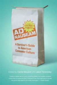
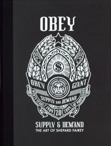
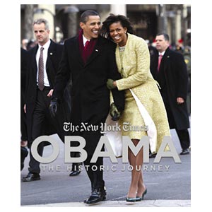
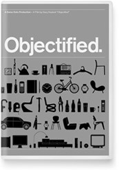
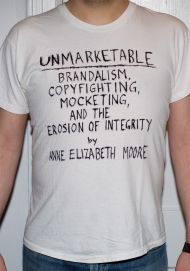


 Kim Fellner's book
  A
A