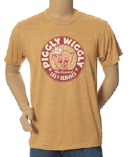
Amusing to see this item named a favorite “Graphic T” by Omiru this morning. “Totally retro,” it says. Perhaps so. But we’re big on the pig here at Murketing HQ, so let me just say: To get the very coolest Piggly Wiggly T designs, you have to go to an actual Piggly Wiggly grocery store. They good news is they’re a lot cheaper than the $37 item pictured above.
Posted Under:
Uncategorized
This post was written by Rob Walker on January 31, 2007
Comments Off on Pig in
To my knowledge, I never signed up for the Colette newsletter. It just shows up in my inbox. But that’s cool, because today it included a bit on a bag they’re selling, co-created by Married to the Mob. Married to the Mob is described this way:
Symbole américain de la sexy bitchy attitude des temps modernes.
I have zero command of French, but that sounds pretty good to me.
Looks like it’s an edition of 10, priced at 850 euros. Here’s the link. The Colette site blasts music upon arrival, fyi.
Posted Under:
Brand Underground
This post was written by Rob Walker on January 30, 2007
Comments Off on Brand summation of the day
In Consumed: Bear Naked: Getting past the granola image — with granola itself.
One of the sturdy clichés of contemporary brand-building is the importance of avoiding an image that’s too “crunchy” or, worse, too “granola-y.” That’s particularly true — and maybe particularly challenging — for businesses that want to transcend green or health-conscious consumer niches. But it’s really challenging if what you’re selling is, in point of fact, granola.
The founders of Bear Naked were conscious of this when they started selling their product in 2002. It was “an enormous issue,” Brendan Synnott says, and for the first two and half years of the brand’s existence, he and Kelly Flatley didn’t even put the word on their packaging. “I used to hate being called granola,” he says. “You hear ‘granola,’ and you think hairy legs and Birkenstocks. That was the reputation.” …
Continue reading at the New York Times Magazine site, by way of this no-registration-required link.
Posted Under:
Consumed
This post was written by Rob Walker on January 28, 2007
Comments Off on Decrunched
There’s a very cool one-pager in the current Brandweek, and unfortunately its coolness can’t really be appreciated in the text-only online version. It’s a breakdown of the different iterations in the design of … a wine label! And of course seeing the pictures is what’s most interesting.
But the overall label strategy is interesting, too. Jim Edwards writes:
In February, The Amazing Food Wine Co., New York, will launch “Wine That Loves.” The brand takes the guesswork out of pairing wine with food. Thus, Wine That Loves Pizza, Wine That Loves Pasta, Wine That Loves Roasted Chicken, and so on. …
Challenges: Critics will say it’s wine for dummies. The bottles won’t carry the wine’s year, varietal or regional information beyond the country of origin—information most wine drinkers consider crucial. …
I’m impressed that the firm that did the design, Lippincott Mercer, was willing to share the early rejected attempts. It’s really interesting to see how the look evolved.
Edwards also notes that “wine packaging is experiencing a design revolution.” Agreed. If we spot Wine That Loves in any of our local shops, we’ll review the label.
Posted Under:
Flickr Artifacts
This post was written by Rob Walker on January 27, 2007
Comments Off on Flickr Interlude

Flickr photo by suzerain
Posted Under:
Flickr Artifacts
This post was written by Rob Walker on January 27, 2007
Comments Off on Flickr Interlude
The new issue of a magazine called 52nd City, published in St. Louis, has the theme, “Stuff.” The editors write:
Most of the submissions we received for this issue dealt with tangible stuff and lots of it. Maybe because we have so much room out here in the Midwest we hang on to stuff a little longer. There were multiple stories reflecting on stuff left behind after someone dies. Stuff collected and stuff purged. Not being able to let go of childhood stuff, gruesome as it may be. Stuff in the bottom of a purse. Stuff found in junkyards. eBay stuff. Sports stuff. In fact, we didn’t have room for all the stuff we wanted to use, so the website is teeming with extra content this issue.
I haven’t seen the issue, but some of the, er, stuff they put online is cool. Such as: “Streetside Pick Up,” by Elie Gardner, and Ari Holtz’s essay “The Burden and Gift of Possession,” which is about getting rid of stuff (a topic of interest to me, as you may recall). So take a look.
Via Ecology of Absence.
Uni Watch offers a pleasing selection of ads from old issues (1950s — 1970s) of Scholastic Coach, a trade mag, with comments from Uni Watch design director Scott M.X. Turner, and Uni Watch head coach Paul Lukas.
Posted Under:
Advertising,
Pleasing
This post was written by Rob Walker on January 25, 2007
Comments Off on From the trades…
… is described this way:
The ad generator is a generative artwork that explores how advertising uses and manipulates language. Words and semantic structures from real corporate slogans are remixed and randomized to generate invented slogans. These slogans are then paired with related images from Flickr, thereby generating fake advertisements on the fly.
Here’s the site. About one out of every five of the resulting “ads” are interesting. That’s not bad, though. It’s part of a thesis project by Alexis Lloyd. Via MetaFilter.
So here’s the question I should have asked at the end of the other day’s entry about manufacturing in the U.S. and lux products and automation of manufacturing and all that.
Okay. So, let’s say you want to Buy American, you like the idea of Things Made in The United States, possibly because that means they are likely to be Sweatshop Free. Well, what about a product that’s made in United States — but in a completely automated factory?
That is, there’s no worry about exploited labor, because it’s all robotics and machinery. On the other hand, it still represents a threat to blue-collar employment, or at least it does nothing to help the manufacturing laborer in the U.S., at all. There’s no suffering — but there’s no solidarity.
Does it matter? Ethical plus, ethical minus, or ethical wash?
The NYT science section has an interesting look at “magical thinking,” like believing in lucky numbers, or other superstitious stuff that many of us indulge in without admittting it:
[M]agical thinking underlies a vast, often unseen universe of small rituals that accompany people through every waking hour of a day.
The appetite for such beliefs appears to be rooted in the circuitry of the brain, and for good reason. The sense of having special powers buoys people in threatening situations, and helps soothe everyday fears and ward off mental distress. In excess, it can lead to compulsive or delusional behavior. This emerging portrait of magical thinking helps explain why people who fashion themselves skeptics cling to odd rituals that seem to make no sense, and how apparently harmless superstition may become disabling.
The brain seems to have networks that are specialized to produce an explicit, magical explanation in some circumstances, said Pascal Boyer, a professor of psychology and anthropology at Washington University in St. Louis. In an e-mail message, he said such thinking was “only one domain where a relevant interpretation that connects all the dots, so to speak, is preferred to a rational one.”
Here’s the rest. The topic reminds me of one of my favorite recent books: Something For Nothing, by Jackson Lears.
One side note: This line of study seems connected, on some level, to pareidolia.
Other side note: I enjoy the general idea of carefully rational empirical study of this subject — maybe we can all come to terms with our own magical thinking if only the scientists can package it up for us with the right data and research findings. I feel luckier already.
Posted Under:
Believing
This post was written by Rob Walker on January 23, 2007
Comments Off on Do you feel lucky?
 Our TV show of the moment is Top Chef, which has turned out to be pretty weird, and pretty entertaining. This Las Vegas Weekly article on recent events that have made the show resemble a psychology experiment gone awry, with some contestents ganging up on strange-haired Marcel, sums up the dynamic: “The consensus on many message boards is that the show is playing out as an allegory for high school: there’s the hotheaded bully, the sly instigator, the sexually frustrated, angry kid, the strident cheerleader with the dubious smile, the shy girl who is always studying in the library, the stoner. Marcel’s role seems to be the socially awkward geek who doesn’t know how to relate to people.”We’ve been puzzling over why every other contestent seems to hate Marcel so much. He seems vaguely annoying, but we never really see him doing anything particularly awful. New York recently interviewed some of the other contestents, and Sam (who is supposed to be sexy hunk-boy, but is actually kind of gross) says: “The past couple of episodes they’ve made him seem like some sort of a sweetheart. Everyone was asking me why I had this outburst with him, but they didn’t show him accusing me of cheating for fifteen minutes.”
Hmm. Anyway, both those links via this post on The Grinder, which earlier had this other post passing along a theory that the most recent episode’s quasi-beat-down of Marcel was even more Lord of the Fliesy than the show suggested, and was toned down through editing.
All those links are full of “spoilers,” as they say, if you haven’t been watching. (If you have been watching, please note that we watch the show Thursdays, not when it airs on Wednesdays, so don’t tell me what happens in that 24-hour gap, okay?) Top Chef is a good candidate for a TV binge next time a “marathon” of episodes is on, so keep that in mind.
Speaking of which: Binge marathon-watching has become an under-examined form of TV watching. I’ve been meaning to write about that forever. I think it’s an antidote to the millions of entertainment choices: You just veg out and let the show wash over you, hour upon hour, as passively as possible….
House Wine
Blends; Columbia Valley
$10 to $14 (Savannah)
[Note: This is the eleventh installment in a regular Murketing feature. For previous installments and an explanation, go here.]
Dr. Vino says: ” Think of this wine as punk rock in a bottle with its loud label and fruit at high volume. Charles Smith, who used to manage a punk band in Demark, now owns K Vintners as well as the Magnificent Wine Co. in Walla Walla Washington.”
Hmmm. With House Wine, we have a case of R. and E not quite seeing eye to eye. Read more
The “Outlook” column by Mark Whitehouse in the WSJ today notes that while we think all manufacturing is leaving the U.S., that isn’t quite so. For example: “U.S. production of audio and video equipment surged about 2% in December and was up 23% for all of 2006.”
So what’s being made in the U.S.? Whitehouse says it’s stuff that’s just not practical to make elsewhere.
One area of strength: high-end goods like top-of-the-line $6,000 Sony Grand WEGA TV sets and $15,000 Sub-Zero PRO 48 refrigerators, which appeal to the affluent folks who have been driving much of the growth in U.S. consumer spending….
“If the thing being sold to the U.S. market is locally customized, delicate, or very large, chances are it’ll continue to be produced in the U.S.,” says Bruce Greenwald, professor of business and economics at Columbia University in New York.
Hey, so maybe lux tastes will save the U.S. factory worker! Well, no. Of course this represesnts a “tiny fraction” of manufacturing. But even the gradual fatttening of this thin segment isn’t likely to create more manufacturing jobs. The Sub-Zero factory in Madison is producing more, but it’s not increasing its workforce.
Across the manufacturing sector, the picture is similar: To stay competitive, companies are doing everything they can to boost productivity — that is, make more stuff with fewer people. “Manufacturing in the U.S. is headed toward plants that have no people in them,” Prof. Greenwald says.
Here’s the link for WSJ subscribers.
Posted Under:
Industry and stuff,
Lux
This post was written by Rob Walker on January 22, 2007
Comments Off on Making it

Mr. Jeff Staple calls my attention to this product: “8 Euros (about US$11) for a beautifully designed bottle of AIR. Yes, flavored oxygen that tastes like crap and makes you feel slightly nauseous. Only ‘marketing’ could allow this product to exist.” Interesting for sure, and possibly inevitable given that water has already been branded so many ways, and so successfully. Thx Jeff…
Posted Under:
Uncategorized
This post was written by Rob Walker on January 22, 2007
Comments Off on Airness


 "
"


 Kim Fellner's book