Red Newt
Cabernet Franc (2004) and “Dry White Wine”
Around $10 to $15 (Finger Lakes region of New York State).
[Note: This is the fourth installment in a regular Murketing feature. For previous installments and an explanation, go here.]
 These purchases came about as a result of a trip (a while back) to the Finger Lakes, where there are a number of wineries and not much to do. A brochure promoting winery tours included a number of photographs of relevant wine bottles, and R. was immediately interested in visiting the Red Newt winery, because of the cool newt drawing on the label. It’s probably not a coincidence that the newt kind of reminded R. of the lizard on bottles of Leapin’ Lizard merlot, which we used to drink quite often in New Orleans.

Anyway we went, and ultimately bought a few bottles. E “generally likes the newt,” but prefers the clear, white wine bottle to the red. Sure, she says, the red bottle benefits from the “nice little newt” on the label, and the fine detail of the newt on the foil thingy on top of the bottle, but is otherwise not that special. But the clear bottle is “one of the most exciting bottles of wine I’ve seen.” R. agrees, although he likes the red bottle more than E does. Still, he is on board with E’s contention that if we had easy access to this particular variety we would probably buy a bunch of bottles. “The clearness and the little guy – very exciting,” E reiterates.
REGARDING THE ACTUAL WINE: These actual bottles were pretty good. However, a different variety of Red Newt white wine, purchased in New York City, with a very similar bottle design, was too sweet, and we never bought it again.
Posted Under:
Wine Packaging
This post was written by Rob Walker on September 29, 2006
Comments Off on The International Review of Wine Packaging and Aesthetics, Vol. 4
Tastes change. I know it, you know it, Bob Dole knows it. (What? Never mind.) Anyway, although we all know tastes change, I was still a little startled by the obit for Evelyn Orton, “booster of Brooklyn brownstones.” Well, who isn’t a booster of Brooklyn brownstones these days? It’s one of the most prestigious forms of housing I can think of.
But in 1963, that apparently wasn’t the case. The obit said:
Victorian homes had fallen into disfavor and many middle-class New Yorkers were moving to the suburbs by 1963, when Mrs. Ortner and her husband bought a four-story 1886 brownstone on Berkeley Place in Park Slope.
Mrs. Ortner, an interior designer before she became a preservationist, was so enchanted by that house, with its original mahogany woodwork and papier-mâché and linseed-oil wallpaper, that she began a campaign to save thousands of other brownstones from neglect or the wrecking ball.
Many of the graceful 19th-century single-family homes in Park Slope were owned by absentee landlords and had been cut up into rooming houses. In other parts of New York, old homes were being lost to federally sponsored urban renewal projects.
Among other steps she and her husband took:
In part because of their own difficulty in getting a mortgage for their $32,500 house, the Ortners were prominent in the anti-redlining campaigns beginning in the mid-1960’s, when many banks were reluctant to finance mortgages in declining neighborhoods like Park Slope, Cobble Hill and even Brooklyn Heights…
“Declining neighborhoods like Park Slope”! Tastes change….
Posted Under:
Obituaries
This post was written by Rob Walker on September 28, 2006
Comments Off on House Partisan
It’s time now for the second in our series of interviews with brand bloggers. Our gracious subject today is Armand Frasco, who presides over three interesting blogs: Moleskinerie (focused on Moleskine notebooks); Notebookism (on notebooks in general); and Positive Fanatics (on Ikea). Here goes…
We first spoke some time back, when I was writing about Moleskine (for Consumed, June 24, 2005), and came upon your site. When did you launch this blog, and why? And how has it changed since then?
Moleskinerie was launched in January 2001 on a whim, just out of curiosity and to find out who else was using the notebook. It turns out the answer is, a lot. Last year, Kikkerland Design, Moleskine’s U.S. distributor reported sales of more than 4 million units. Moleskinerie has since become the number one fan site for the product, with readers coming from as far as South Africa, Mongolia, Malaysia –- even Patagonia.
Lately you’ve started a newer site, called Notebookism. What’s that one all about, and why did you start it?
I initiated Notebookism last July in response to many requests for a non product-centric blank-book blog. With hundreds of brands and legions of aficionados out there we’ve just uncovered the tip of the journaling iceberg. Many Moleskine users also own other kinds of notebooks so Notebookism is just an extension of their paper playground. We are lucky to have the Blick Art Company as our founding sponsor.
What’s the big news around Moleskine these days, and how does it affect these two projects, if it all?
Read more
Posted Under:
Blogging The Brand,
Fandom,
Murketing,
Q&A
This post was written by Rob Walker on September 25, 2006
Comments Off on Brand Blogger Q&A: Moleskinerie, Positive Fanatics, and Notebookism
One pleasing surprise that awaited me as I eased back into the habits that go with having an actual working computer was discovering this nice notice on UrbanCommons.org about another one of my little side projects, the MLK BLVD Flickr pool. And so I say: Thanks!
Of course, if you visit Murketing.com often, you’ve probably already figured out that I spend too much time looking at stuff on Flickr. But another pleasing surprise was finding some pictures added to the MLK BLVD pool by a certain crfranko — shots of the MLK in El Dorado, Arkansas. El Dorado? I know who you are, crfranko! Thanks, bro …
In Consumed: Umpqua Bank: Selling a financial institution as a lifestyle brand.
Ours is the age of lifestyle. From clothes to coffee to cookware, every product or service seems to represent not just function but a statement about who we are and how we live. So the fact that Umpqua Bank, a chain based Portland, Ore., recently announced that it had “released its first album” makes a certain kind of sense. Umpqua isn’t just a financial institution, of course. It’s a lifestyle….
Continue reading at the NYT Magazine site via this no-registration-required link.
Additional links: Umpqua; Rumblefish.
In Consumed: Wonder Bread: What a hit movie can do for a venerable brand — and vice versa.
The proliferation of product and brand placement in movies and television programming has become so extreme that it’s barely noted anymore. An exception to this is the attention focused on the prominent inclusion of the Wonder Bread logo in the recent Will Ferrell vehicle “Talladega Nights: The Ballad of Ricky Bobby.” Given that the comedy is set in the world of Nascar racing, where every car and every driver moves about in a branded sheath, it was inevitable that nearly every frame of the film would be cluttered with logos. What got people interested in Wonder’s inclusion is that the brand didn’t pay for it. Shortly after the film opened, a marketing consultancy called Joyce Julius & Associates issued a press release saying that “the Wonder Bread logo appeared clear and in focus for 11 minutes 32 seconds (11:32), while the brand was also mentioned on two occasions by the actors,” and that, it asserted, added up to media exposure worth $4.3 million. Another observer guessed that buying this level of exposure might have cost as much as $100 million. …
Continue reading at the NY Times Mag site via This Link.
Related link: Wonder/Ricky Bobby cap at Nascar online store. RetroCrush’s “Inside Look at Wonder Bread.”
Posted Under:
Consumed,
Murketing
This post was written by Rob Walker on September 23, 2006
Comments Off on Free Ride
So, about a week ago, the hard drive on my main computer began to fail. This was unpleasant. While it was interesting, in a way, to spend a lot of time waiting around at TekServe observing other people whose various pieces of digital technology had melted down in one catastrophic way or another, I’d prefer not to have done it. Anyway, while all that was going on, it wasn’t really practical for me to deal with Murketing.com.
Yesterday I got my computer back, with a new hard drive, and it looks like I’ve more or less completed the process of re-integrating many gigs of backed up data. I’m a little behind on email, and I may have lost a few messages, if you happen to be wondering why I haven’t replied to something you’ve sent me, etc. Feel free to re-send if you like. Meanwhile I’m returning this site to regularly scheduled programming now; in a minute I’ll post last week’s consumed.
Go back up your data.
Posted Under:
rw
This post was written by Rob Walker on September 23, 2006
Comments (2)
In an article in the September 11 issue of Brandweek, headlined “For Some Marketers, Low Income is Hot,” Constantine Von Hoffman writes: “Marketers have discovered a new and sizeable underserved consumer demographic: the poor.”
For instance, P&G has introduced Bounty Basic and Charmin Basic, for the “price-sensitive” low-income consumer. Prepaid phone and (in particular) debit cards are also aimed at this “large, untapped pool of consumers,” namely the 20 million U.S. houeholds “without a bank account or relaible access to banking services.” Someone with a prepaid card company called Netspend comments: “For a long time companies did not realize that these low- to middle-income people can be profitable.” Participants in this exciting new market include Nascar, Virgin Mobile, and Domino’s Pizza.
We’re big fans of BBQ-joint signage featuring jolly pigs carrying steaming plates of ‘cue. So sad. But this, I admit, is even more poignant.
I just realized I forgot something I wanted to mention in my post a little while ago about the Point of Purchase show: two other recent examples of semiotic disobedience in the news lately.
Street-art star Banksy got a lot of attention for his latest stunt, which was shopdropping some altered Paris Hilton CDs. “Banksy is notorious for his secretive and subversive stunts,” the BBC explains, adding some details about this particular prank:
Banksy has replaced Hilton’s CD with his own remixes and given them titles such as Why am I Famous?, What Have I Done? and What Am I For? He has also changed pictures of her on the CD sleeve to show the US socialite topless and with a dog’s head.
Banksy’s done some cool stuff, but this seems pretty lame. Seriously: Paris Hilton? Is there supposed to be something surprising — let alone subversive — in the idea of criticizing Paris Hilton for having no talent? Hasn’t that idea already been expressed by, oh, I don’t know, everybody? Maybe this doesn’t even count as semiotic disobedience after all, since the aim seems to have more to do with hyping Banksy than striking a blow against a silly socialite. Or maybe it’s all a meta comment on publicity.
Anyway, the other example: The Ronald McHummer Sign-o-Matic. This, too, is getting a lot of attention online. A response to a McDonald’s promotion that involved giving away Hummer toys, it is “an interactive website that lets you write your own slogan or message about the Hummer giveaway, display it on a McDonald’s marquee, and send a message to the president of the fast-food chain.”
As I type, the site says, “over 99,000 signs served,” presumably referring to the number of messages sent to McDonalds’ execs from the site. If that’s accurate, it’s pretty impressive.
 There’s no Consumed in today’s issue of the Times Magazine, so here is a bit of a follow-up to last week’s “semiotic disobedience” column. The Point of Purchase show at the Dumbo Arts Center through September 24 (mentioned in the Rosemary Williams Q&A below, which you should really read if you haven’t already), includes a few other artists whose work could, I think, be considered in the realm of the semiotic disobedience concept that Sonia Katyal described in that column.
One example is the “Whirl Mart” project, which I’d heard about before and always thought sounded fairly amusing: “It is a ritual during which a group gathers and silently pushes empty carts through the aisles of a superstore.” Silly, childish — but, again, sort of amusing. (Recall the previously mentioned Wal-Mart podcast — maybe somebody should do a group show on Putting the Art in Wal-M(art).)
And then there’s “shopdropping.” I can’t remember where I first read about this, but basically it’s a project of Ryan Watkins-Hughes, who replaces the labels on canned goods with his own photography/artwork, and puts the results on shelves in stores: “Shopdropping strives to take back a share of the visual space we encounter on daily basis,” he explains on this site, where you will also find (click “related projects”) a list of precedents and/or similar actions. Some of these could be counted as semiotic disobedience (especially the work of the Barbie Liberation Organization, dating back to 1989), others not.
Obviously not everything in Point of Purchase can be classified as semiotic disobedience, but there’s a lot of very thoughtful work about consumer culture. I’ve long been interested in Julia Christensen’s Big Box Reuse project. I wasn’t familiar with, but enjoyed learning about, a shopdropping variation by Zoë Sheehan Saldaña: She buys clothes from places like Wal-Mart (there it is again!), hand-makes a duplicate, moves the tags, and returns the duplicate for a refund, meaning her hand-made version is presumably put back on the racks and sold. I was also interested to learn about Stefanie Nagorka, who constructs sculptural forms out of materials in places like Home Depot, then photographs them, and leaves.
And the show had work by several photographers who do nice stuff, notably: Brian Ulrich and Monika Sziladi (whose site seems to be down). Also worth note is the cool “limited edition weekly circular” for the show, by Nicole Tschampel & Bryan Bennett.
In all, a nice job of pulling together a good group of artists by curator Gretchen Wagner. Too bad the Dumbo Arts Center site doesn’t have links to the sites of all these creators — but luckily the aforementioned Brian Ulrich pulled just such a list together, and I’ve raided it liberally in writing this post. Check his site for links to artists I haven’t mentioned here, since I didn’t want to rehash the entire show.
Posted Under:
Flickr Artifacts,
rw
This post was written by Rob Walker on September 7, 2006
Comments Off on Flickr Interlude
This illustration appears, in rather tiny form (like less than one inch by one inch), on the package for a product called the “Streetwise Key Chain Alarm (with light)”. Basically it’s a key chain attachment that emits a massive sonic blast, unleashed by pressing a button on the device, when you’re about to be attacked by a faceless bad guy. As the tag line on the package says, this is useful “… because our streets our no longer safe.”
That bit of copy speaks for itself. But it’s the illustration that I want to focus on here. I love it! What I love is how totally bored the woman looks as she wards off her shadowy attacker. She seems about as engaged as someone opening a garage door: “Oh, a thug — whatever, I’ll just zap him with the strength of a million decibels.” I also like her sensible outfit and hairdo — and of course, props to the thug for wearing that old-school bad-guy hat.
If I were independently wealthy, I would have an art gallery devoted to nothing but pieces like this. Thumbs up, Streetwise Key Chain Alarm illustrator — thumbs up.
 Earlier this year, as you may know, Brian Eno and David Byrne marked the 25th anniversary of their astonishing 1981 collaboration album, My Life In The Bush of Ghosts, by launching a site that made available all the multitracks for two songs from the album to any and all remixers (who sign up with a specific but apparently pretty enlightened licensing agreement). Our friend Disquiet has kept tabs on the results, pointing out some of the more interesting creations — but recently he offered a new spin on the whole idea: “Our Lives In The Bush of Disquiet.” As he explains:
For Our Lives in the Bush of Disquiet, I contacted a dozen musicians whose work I admire; I wanted to hear what their renditions of the Eno and Byrne tracks might sound like, and none of them had yet joined in the activities at the bush-of-ghosts.com website. With only a few exceptions, these individuals already participate regularly in the loose community of musicians who post their own music for free download on the web, via netlabels, social networking services or their own websites.
The 12 graciously agreed to participate in this project and the resulting compilation ranges from tributes to reconsiderations, from distant reflections to associative interpretations. There are takes on “Help Me Somebody” that milk the funk in the preacher’s voice and there are takes on “A Secret Life” so quiet as to make the original sound like rock’n’roll by comparison.
I was quite interested to hear about this, because I don’t know anybody who is better versed on the curious intersections of music and technology than Disquiet; the site, revolving around “Reflections on ambient /
/ electronic music, and interviews with the people who make it,” is a constant trove of great information and discovery. Basically, if anybody could come up with a compelling curated iteration of a thoroughly wild-and-woolly phenomenon like the Bush of Ghosts remix project, it’s Disquiet.
The 12 remixes, as well as front-and-back cover art by boon (design), are available for listening or downloading here (where there’s also more about each of the contributors and their tracks) and here. My own favorites: “My Bush in the Secret Life of Ghosts,” by Prehab; “If You Make Your Bed in Heaven,” by Roddy Schrock, and “Not Enough Africa,” by Ego Response Technician (who, I should disclose, is also a friend of mine).
Posted Under:
Music,
Pleasing
This post was written by Rob Walker on September 7, 2006
Comments Off on Mixing the remixes (or something like that)

“Cheeramids #3, by Ernie ButtonAs promised, I stopped by the opening last night of the latest Hey, Hot Shot! exhibition at the Jen Bekman gallery in Manhattan. And as expected, I particularly enjoyed the photographs from Kate Bingaman. But I also want to mention the work of Phoenix-based Ernie Button. Somehow when I’d looked at his pictures online, they didn’t have the same impact that they had in person. The are pictures of “landscapes,” made of cereal. For example, the picture here is of Cheerios.
His statement for the show reads in part: “When I was a child, cereal was a luxury item. Brand name cereals were a rarity, as they were consistently more expensive. Something like King Vitamin (a popular 70s cereal) or Cap’n Crunch made for pure breakfast heaven. Looking at the cereal aisle today, it’s clear that breakfast cereal has changed. The cereal aisle has become a cornucopia of colors with marshmallows that resemble people and objects and characters from movies. It’s apparent that cereal is not just for breakfast anymore; it’s playtime. In keeping with the playtime theme, I began to construct landscapes that would utilize the natural earth tones of certain cereals. I placed enlarged photographs of actual Arizona skies … in the background of the cereal landscapes, giving the final image an odd sense of ‘reality.'”
Poking around online, I found some more of Button’s images here and (of toys, in this case) here. But if you’re looking to buy, I of course suggest you go through Bekman’s gallery. The Hey, Hot Shot! pictures are on view there until September 10.



 "
"




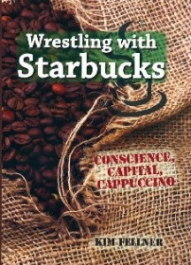 Kim Fellner's book
  A
A