This was one of my favorite column topics ever. I still see donks around town here in Savannah, and other points south. I don’t see as many with exciting brand-inspired themes, though. Then yesterday I saw this excellent Cap’n Crunch donk on Flickr, I believe taken in Little Rock:
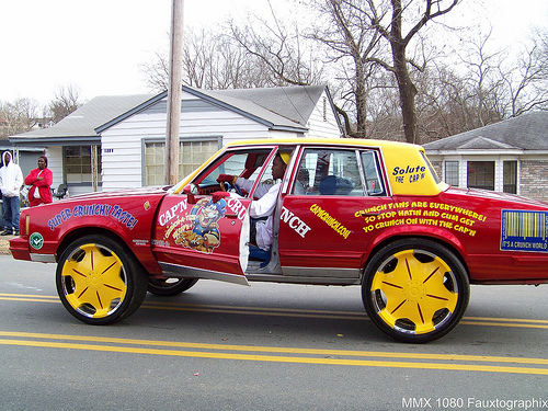
Pic by 1080Graphixdesign
Then after poking through some Flickr pools, this from Greenville, AL:
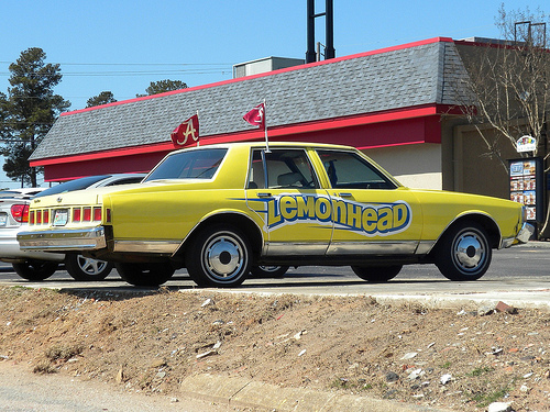
Pic by Katie and Joe
Great stuff.
Posted Under:
The Designed Life,
Update
This post was written by Rob Walker on April 29, 2010
Comments Off on Another random consumed update: Themed-out donks
Given my interest in Things That Look Like Other Things, it’s inevitable that some would pop up in this series.
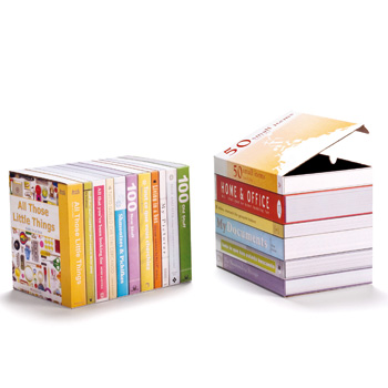
Boxes That Look Like Books. Click for more.
Bookshelf blog reports: “Designed by Peleg Design. Printed cardboard boxes for elegant storage on book shelves.”
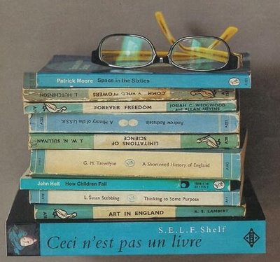
Shelf That Looks Like A Book. Click for more.
Note the title of the bottom “volume.” Bookshelf blog notes that it is actually “a small shelf with the appearance of a book.”
Posted Under:
Products,
The Designed Life
This post was written by Rob Walker on April 28, 2010
Comments Off on Books, the idea, cont’d: This is not a book.
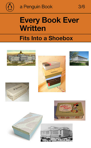
Douglas Coupland:
Last month I installed new bookshelves in a room in my house. They’re black, and my painter offered the unsolicited opinion that they might look depressing when completed. I knew he was wrong because, at the very least, the paperback shelf couldn’t help but have a cheerful orange zing a zing that comes from the Penguin spine, the most wonderfully insidious default interior design statement in our culture.
Of course he’s not simply expressing this opinion in public; it’s part of “A Penguin 75th Anniversary Project By Douglas Coupland.” (Is it just me or has “project” become the trendy word of the moment? Everybody is working a “project” now. Or several “projects.”) This is essentially an appreciation of Penguin cover design, which deserves appreciation: It is, in fact, iconic.
The project, as I understand it, is to use this graphic form (the Penguin cover) as template through which to “speak to the past.” He asks: “How would you speak to someone in the year 1935 from 2010 using a Penguin cover?” Coupland’s answers are here; templates can be downloaded here and people who have done so have added their creations to this Flickr set.
To be honest, I wasn’t really that impressed with any of the results so far. But one of Coupland’s examples (above) caught my eye, and one of the “crowd” submissions (below) caught my eye, and seemed relevant to this series. And, again, I really do think Penguin’s design style is iconic.
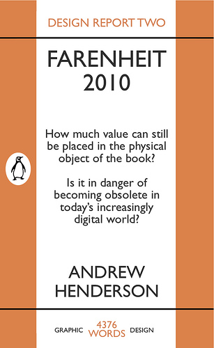
“What is it with all these books?” Nicholson Baker asked in the 1995 New Yorker piece about books used as props in catalogs (as mentioned yesterday). And given that date it’s a little surprising that he continues: “Isn’t the Book supposed to be in decline – its authority eroding, its informational tax based fleeing to suburbs of impeccably edged and weeded silicon?”
Fifteen years later, that’s still the conventional wisdom. (Which doesn’t mean it’s wrong – just that like so much of today’s digital euphoria, it’s really familiar. Sometimes it amazes me how little has changed in the past decade and a half. But that’s another story.) Baker’s story wasn’t about the future of publishing, it was about what books, as objects, signify — after all, those catalog pages weren’t full of random cassettes, or old magazines, or stray cell phones. I mentioned some of his answers in yesterday’s post.
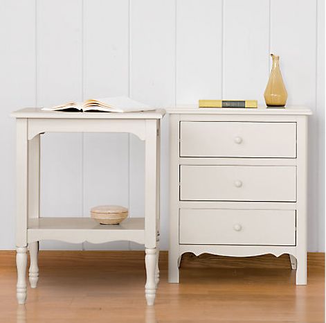
What I got curious about is whether, fifteen years later, books still serve this sort of function – not in mail-order catalogs, per se, but in their online descendants. I spent a bit of time poking around the site of The Company Store. Poking around a web site is a far different experience than paging through a catalog — much more lean-forward, as they say, clicking and making decisions instead of idly following the flow while letting the mind wander. But I found a few things before I got tired of the exercise.
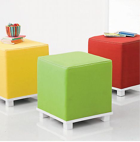
At the top of this post is the Romantic Table Collection (it now seems to have disappeared from the site) — included a couple of volumes in a manner that I suspect would have fit right in with the catalog imagery Baker pondered a decade and a half ago. Below: Vivid Ottoman. I enjoy this use of books as props, because the little stack on the left is being deployed, somewhat absurdly, as a superfluous and probably unwieldy stand for a vase. This seems to degrade the of the book, if you ask me: The possibility of these books being opened is basically eliminated; books become just things lying around to be put to some kind of “use,” however pointless.
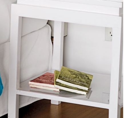
In this entry for Colorblock Bedding (also now gone), I noticed the books under the nightstand, but …
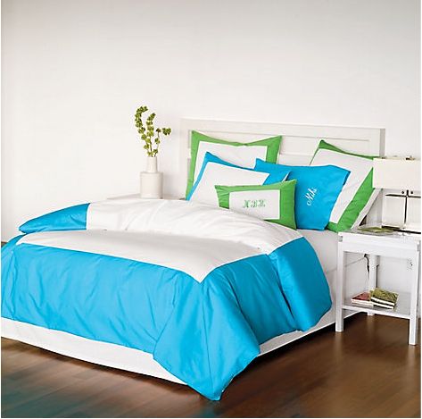
… what’s odd is that if you look closer you’ll notice that these appear to be two identical copies of each of two books. What would explain this? Baker noted certain books popping up in multiple photographs in a single catalog — but multiple copies of the same title in the same image? This seems like sloppiness on the part of the props person, no? And again: a bit of an insult to the idea of the book.
One more post related to the Baker piece next week – sorry to go on about it, but there’s so much in that seems important to the this occasional series on idea of the book.
Posted Under:
The Designed Life
This post was written by Rob Walker on April 23, 2010
Comments Off on The idea of the book: Catalog props revisited
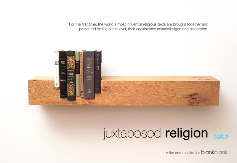
Click for more.
This shelf and set of religious texts are (or I guess were) sold together — the idea is the world’s religions are “presented on the same level,” according to BlankBlank. I suppose you could read the books, too; or you could simply co-sign on the general concept and treat this as a statement of your enlightenment, and leave it at that. Note that the shelf, while taking a rough-and-ready “reclaimed hardwood” form, is elegantly branded:
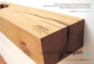
This was the first in a “series of curated bookshelves.” The second in that series: “Seven of the world’s most seminal texts on power and its relationship to the ordering of society are brought together and presented on the same level.”
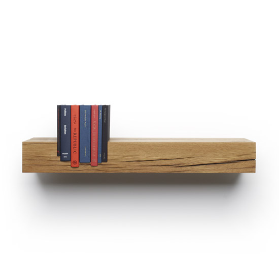
Power. Click for more.
The books: Leviathan by Thomas Hobbes, The Federalist Papers by James Madison, Alexander Hamilton, and John Jay, The Republic by Plato, On Liberty by John Stuart Mill, The Communist Manifesto by Karl Marx, The Conquest of Bread by Peter Kropotkin, and Social Justice in Islam by Sayyid Qutb.
The price is $3,000.
I’m thinking a wall-decal version might a good alternative to offer entry-level consumers. (And perhaps a small, sticker version to put on a mobile reader device?)
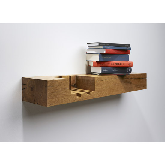 Part of a series. Thx for the tip: Harold.
Posted Under:
The Designed Life
This post was written by Rob Walker on April 23, 2010
Comments Off on Books, the idea, cont’d: the “curated bookshelf”
Via Harold Check. Part of a series.
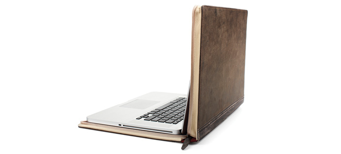
BookBook, click for more.
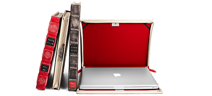
BookBook, Click for more.
Posted Under:
The Designed Life
This post was written by Rob Walker on April 18, 2010
Comments Off on Books, the idea, cont’d: Laptop-disguising bookform
I mentioned that I’d have a couple of bits of news from the Significant Objects project that might be of interest to Murketing readers. Here’s one bit.
Today’s story (part of our Paola Antonelli team up, co-published on Core77) is by Matt Brown. I’ve mentioned him a couple of times here in the past; a post on Metafilter described him as a “design fiction enthusiast,” which sounded close enough to my interest in imaginary brands that I was curious. And his work just completely blows me away: He has a peculiar genius for devising alternative histories for random, mass-produced stuff, and expressing this design fiction with both words and, more unusually, completely invented packaging. (In fact he’s now doing a series for Core77, Design Fancy.)
We knew we wanted him involved in Significant Objects. And when Paola Antonelli presented me with her objects, there was one that struck me as being perfect for Brown. This:
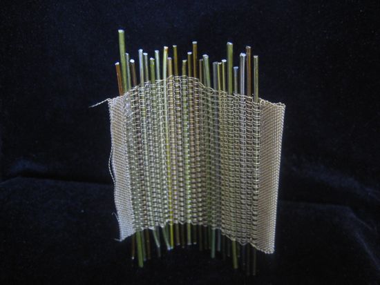
What is it? Well, Anotelli wouldn’t tell me. Turns out Brown, as I suspected, had an answer. It’s a “crumpter.”
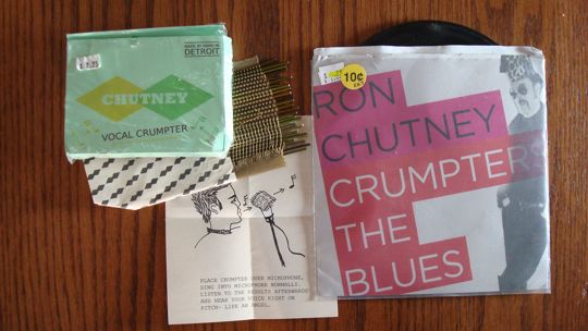
A crumpter, it turns out, is a sort of analog precedent to autotune. Never heard of that? Oh, well then, please read the story over at S.O.
And yes, all the collateral material Brown created is part of the auction.
We’ve sold a mystery object, we’ve sold a story that was itself an object, and now an object whose story is told in part through its packaging.
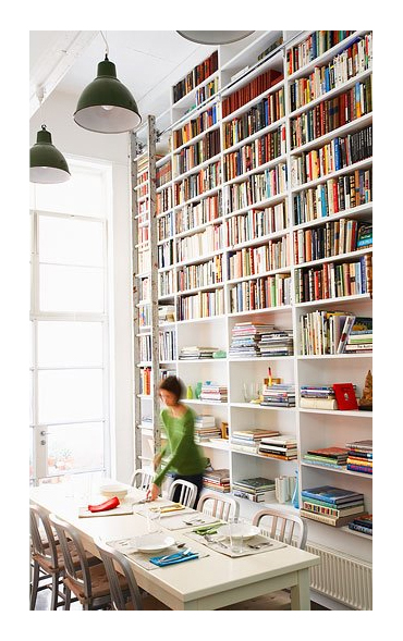
Dining room designed by Diane Bergeron Interiors. Click for more info.
Posted Under:
The Designed Life
This post was written by Rob Walker on April 7, 2010
Comments Off on Books, the idea: The classic book wall
This Smithsonian.com writeup on Penguin paperbacks makes some interesting observations about how their success was tied to their object-ness — both in terms of design and branding:
Penguin’s graphic design played a large part in the company’s success. Unlike other publishers, whose covers emphasized the title and author of the book, Penguin emphasized the brand. The covers contained simple, clean fonts, color-coding (orange for fiction, dark blue for biography) and that cute, recognizable bird. The look helped gain headlines. The Sunday Referee declared “the production is magnificent” and novelist J. B. Priestley raved about the “perfect marvels of beauty and cheapness.”
Posted Under:
The Designed Life
This post was written by Rob Walker on April 6, 2010
Comments Off on Books, the idea: “Beauty and cheapness”
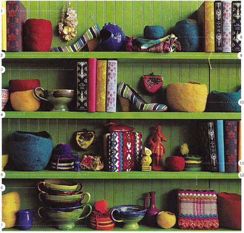
Via Jezebel, click for more.
In a thoughtful comment to a December 2009 post on Significant Objects (in which I noted examples of art made from books, and ruminated on the possibilities of “upcycling with words”), Jim Rosenau mentioned a Nicholson Baker New Yorker essay called “Books As Furniture.” I finally got around to tracking that down and reading it this weekend, and I must thank Mr. Rosenau. The piece, from 1995, is amazing.
It’s in the New Yorker archive, here, but I guess you have to be a subscriber to access it. It’s going to take me more than one post to deal with all the great observations in this essay (are you out there RAOJ?) but by chance there’s opening to get started today.
In a nutshell, Baker starts noticing the books used as props in home decor catalogs, and looks into it. And, you know, he does that Nicholson Baker thing, of learning a shocking amount, conveying it to us with one insight after another, and basically just making the whole experience a reading pleasure. More specifics in the days ahead, but in the short term I happened to become aware by coincidence just today that Jezebel (a site I visit rarely, not that there’s anything wrong with it) has a kind of recurring feature that involves … scrutinizing catalogs. The image at the top of this post, for instance, is from an Anthropologie catalog.
You’ll notice, of course, the books, looking quite pleasing there with all the other stuff on that just-so shelf. But those aren’t props (or at least not just props) like the books that Baker noticed in various catalogs: Anthropologie evidently actually sells ’em:
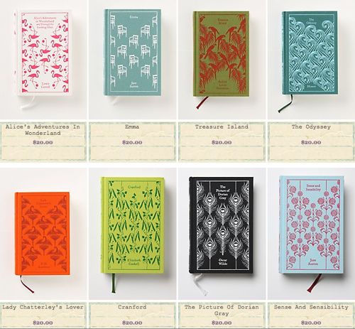
Anthropologie book selection. Click for more.
And let’s face it: They look great.
More on Baker’s 1995 piece as this series continues.
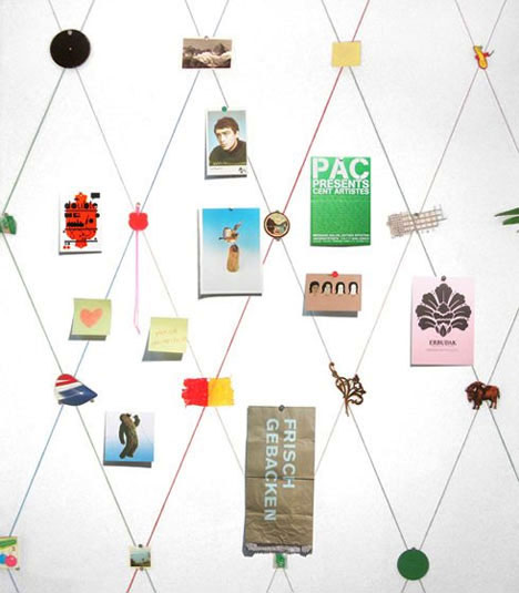
By Sarah Kueng. Click for more info.
Creator Sarah Kueng writes: “I composed the wallpaper from everyday objects and found objects. The objects are arranged in a grid designed to generate calm. The wallpaper inspires the viewer to add personal objects. The result is an interesting mixture of new and old, and two and three dimensions.”
Via Core77’s Lisa Smith, who has more to say, here.
Pictures of Stuff is an occasional series.
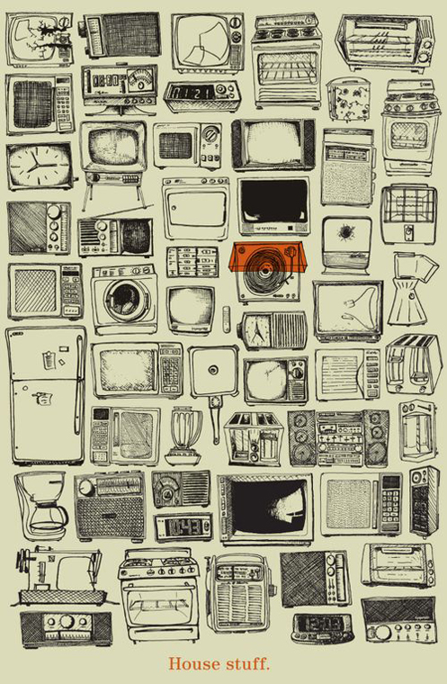
Via The Design Cubicle
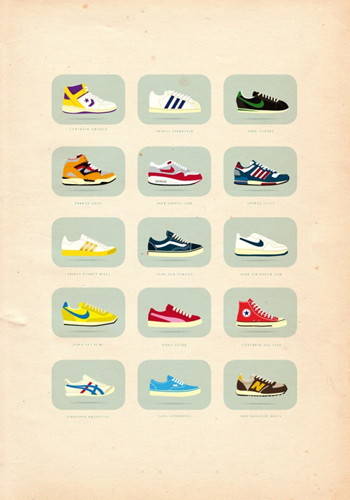
Via The Design Cubicle
Both from this post (artists not named). Pictures of Stuff is an ongoing series.
Posted Under:
The Designed Life
This post was written by Rob Walker on March 30, 2010
Comments Off on Pictures of Stuff, cont’d: house stuff; sneakers
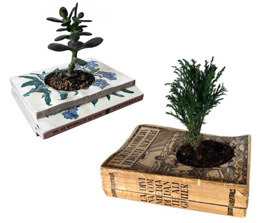
As planters.
Assessment: “Here’s a line of brilliant eco-planters: recycled book pots from Italy’s Gartenkultur. The concept — old books with holes carved into the middle to accommodate soil and a small houseplant — is simple enough (perhaps even enough for a DIY job) and quite beautiful.” Via.
Posted Under:
The Designed Life
This post was written by Rob Walker on March 29, 2010
Comments Off on The idea of the book, cont’d: As planter

Maybe you’re aware of the controversy about this map. If you’re not: What does it communicate to you, visually? Does it look like a graphic from some movie about a violent assault on the United States? Or just a mundane political-strategy graphic?
If you are aware of the controversy, then you know that’s pretty much what he controversy boils down to. The full map below was published on Sarah Palin’s Facebook page, and critics say it’s sending a dangerous visual message in a moment when lawmakers are reportedly receiving death threats about their positions on health care reform. Palin, I gather, says such critics are making a phony argument and the imagery is benign.
An interesting design-interpretation disagreement. And one that seems pretty hard to hash out, because it’s hard for any observer, I suspect, to separate what one sees from one’s politics.

Raise the subject of aesthetics when you’re wondering aloud about design, and somebody is sure to pipe up and say something along the lines of “Design isn’t how it looks; it’s how it works.” This is true — but false. True: A great-looking product that does not work is indeed Bad Design and will fail in the marketplace. And yet: Please show me a product or object hailed by the design elite as Good that doesn’t just so happen to be aesthetically pleasing. (To the design elite, anyway.) “How it looks,” in other words, matters, both to the critics and to the market.
Julie Lasky has an essay on Design Observer, Superbeauty, that is very much about “how it looks.” She contends that “beauty” has made a comeback in the 21st century, and evidence can be found in the design world; the essay is in connection with an exhibition called The State of Things: Design in the 21st Century, for which she co-curated a set of objects under the heading Super Beauty:
The category is based on the premise that nothing in today’s domestic environment is too modest or obscure to be prettified: sink strainers, dish soap packages, extension cords, humidifiers, radiators, computer components, fire extinguishers. It is as if contemporary designers have vowed to make an utter sweep of domestic inventory and leave nothing unpleasing to the eye.
The rest of her essay is here. I can’t speak with the sort of authority that Lasky can about this subject in the broader context of design and art criticism, so I was interested to get that perspective.
For what it’s worth, since the early days of Consumed I’ve addressed how I think “how it looks” makes a discernible difference in the marketplace. Read more


 "
"




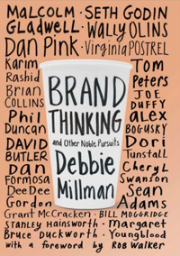

 Kim Fellner's book
  A
A