Bitch
Barossa Grenache; Australia
$16 (Savannah)
[Note: This is the thirteenth installment in a regular Murketing feature. For previous installments and an explanation, go here.]
Let’s face it: If you buy a wine called Bitch, you know full well that you’re buying the label, and whatever’s inside the bottle is pretty much an afterthought.
Many labels that are meant to stand out from old-school “traditional” designs do so by presenting a more approachable, unpretentious image. Bitch, however, is an example of what might be characterized as a ’tude wine, with a label that’s not so much unpretentious as defiant. Read more
Yard Dog
Petit Verdot-Cabernet-Melboc blend; South Eastern Australia
$13 (Savannah)
Bulldog Red
Syrah-Grenache-Mourvedre blend; Paso Robles, California
$18.50 (Savannah)
[Note: This is the twelfth installment in a regular Murketing feature. For previous installments and an explanation, go here.]
Yes, that’s right, it’s a special double-shot of wine label aesthetics today, as we assess two dog-themed labels.
First up: Yard Dog.
As you can see, the label depicts a frightening, teeth-bearing dog, who looks starved, angry, miserable, and dangerous. This poor beast is juxtaposed against jaunty polka dots and some newsprint, in a collage effect. It’s quite an image. Particularly for a wine label.
It caught E’s attention the store, and resulted a rare instance of wanting to read the backmatter: “I really wanted some information.” Read more
House Wine
Blends; Columbia Valley
$10 to $14 (Savannah)
[Note: This is the eleventh installment in a regular Murketing feature. For previous installments and an explanation, go here.]
Dr. Vino says: ” Think of this wine as punk rock in a bottle with its loud label and fruit at high volume. Charles Smith, who used to manage a punk band in Demark, now owns K Vintners as well as the Magnificent Wine Co. in Walla Walla Washington.”
Hmmm. With House Wine, we have a case of R. and E not quite seeing eye to eye. Read more
El Felino
Malbec, Mendoza, Product of Argentina
About $15 (Jersey City)
[Note: Here I finally finish clearing the Jersey City inventory of wine-label-related entries.]
[Note: This is the tenth installment in a regular Murketing feature. For previous installments and an explanation, go here.]
 Earlier this year, R. wrote a “Consumed” column about “critter wines” — meaning wine labels that featured a representation of an animal. (Or “critter.”) Yellowtail was the high-profile example in that piece, but of course there are many, many critters on the wine aisles these days.
And in this case, we picked this up because we liked the cat illustration. It’s a bit more arresting than a lot of the critters you see. A little more stylish. Yet still somehow cute. And of course it’s all about cuteness. But you knew that.
Read more
Posted Under:
Reviews,
Wine Packaging
This post was written by Rob Walker on December 27, 2006
Comments Off on The International Review of Wine Packaging and Aesthetics, Vol. 10
Terre Del Primitivo “red wine from Puglia.” 2003.
About $12. (Jersey City)
[Note: Here I continue clearing the Jersey City inventory of wine-label-related entries.]
[Note: This is the ninth installment in a regular Murketing feature. For previous installments and an explanation, go here.]
 R bought this wine because of the photo-style label. The photo label approach is generally a bad idea, and by and large we tend not to buy wine with label photography. “It seems wrong,” E explains.
In this specific instance, the results are particularly bad. The photograph tells you nothing, and the inexplicable blocky black shape underneath it has no logical graphic function. The back says the photo “illustrates” some “cone-shaped stone buildings” unique to the Puglia region. Yeah? This strikes R. as something less than an explanation. E is more concise: “I don’t care.”
Bottom line: In our view, wine packaging ought to somehow suggest a handcrafted process, not cheap mass production.
REGARDING THE ACTUAL WINE: We can’t remember anything about it.
Sidewise
Pinot Noir. 2003. ($11 in Jersey City)
[Note: Speaking of JC, and of wine, there’s going to be a small avalanche of installments of the IRoWPaA over the next two weeks. I’m extremely busy trying to finish another project, and I have a lot of “inventory” of pictures and notes of wines we bought and consumed before we moved. So I’m going to be clearing that inventory out, and otherwise sort of neglecting this site through the end of the month. Just so you know.]
[Note: This is the seventh installment in a regular Murketing feature. For previous installments and an explanation, go here.]
 When R. spotted this on a liquor-store shelf, he pretty much had to buy it. Yes, because of the label, but no, not because he thought there was anything inherently interesting in its design. R. bought it, of course, because of the blatant attempt to tie the wine to the movie Sideways. A film, by the way, that both E and R. hated.
For reasons that escape us, a lot of people liked Sideways, a movie about an unpleasant sad sack whose only supposedly redeeming feature was being an insufferable wine snob. It’s been widely noted that this character’s rant against merlot actually hurt merlot sales in the real world. The only thing dumber than being embarrassed to buy merlot because a fictious character sneered at the stuff would be buying a wine called Sidewise. “The very idea of trying to attract people who would be attracted to that movie,” as E put it, “is repellent.”
Read more
The Show
Cabernet Sauvignon. 2005. ($13 in Savannah)
[Note: This is the sixth installment in a regular Murketing feature. For previous installments and an explanation, go here.]
 E was shopping at a big ol’ wine store, and when she spotted this bottle she thought: “Wow, that reminds me of Hatch Show Prints.” (Here’s the deal on Nashville-based Hatch, if you’re not up on it.) She took a closer look and found that, according to the back matter, the wine was actually “Inspired by the bold letterpress show posters that Hatch Show Print has produced since 1879.”
Well … what does that mean? That these people weren’t really thinking about making wine until they encountered Hatch Show Prints? And then said: “You know what this makes me want to do – make some wine!” It is, E reflects, “about as stupid a reason to make wine as any I’ve heard.” She wonders what, say, some 10th-generation French winemaker would think of a wine inspired by posters.
And yet, she adds, “I was drawn to it. Because I like Hatch Show Prints.”
Read more
Posted Under:
Reviews,
The Designed Life,
Wine Packaging
This post was written by Rob Walker on December 15, 2006
Comments Off on The International Review of Wine Packaging and Aesthetics, Vol. 6
Two Brothers Big Tattoo Red
Cabernet Sauvignon. 2003. ($10 in Jersey City)
[Note: This is the fifth installment in a regular Murketing feature. For previous installments and an explanation, go here.]
 Like the bull wine, this has a dangler (or “dangly,” if you prefer). In this case the dangled item is a pink ribbon, which we will address in a moment.
First the label. Here the style, as echoed in the name, is tattoo-ish. It is a big bold fleur de lys, rendered in a tattoo style. Eye-catching! As is often the case these days, the back label includes a lengthy text that tells us all about the story behind the wine: The two brothers are a wine guy and a tattoo artist. They created this wine “in honor of” their mother, who died of cancer. Thus the pink ribbon. Fifty cents of every bottle sold goes to a cancer-related charities.
We like the illustration quite a bit, and the typography. Also the shape of the label. On the other hand, E suggests the “2 Brothers” at the top of the front label might have looked better, typographically, with the word “Two,” upper-lower. The type face is not so strong in its current all-upper usage.
Read more
Posted Under:
Reviews,
The Designed Life,
Wine Packaging
This post was written by Rob Walker on November 14, 2006
Comments Off on The International Review of Wine Packaging and Aesthetics, Vol. 5
This illustration appears, in rather tiny form (like less than one inch by one inch), on the package for a product called the “Streetwise Key Chain Alarm (with light)”. Basically it’s a key chain attachment that emits a massive sonic blast, unleashed by pressing a button on the device, when you’re about to be attacked by a faceless bad guy. As the tag line on the package says, this is useful “… because our streets our no longer safe.”
That bit of copy speaks for itself. But it’s the illustration that I want to focus on here. I love it! What I love is how totally bored the woman looks as she wards off her shadowy attacker. She seems about as engaged as someone opening a garage door: “Oh, a thug — whatever, I’ll just zap him with the strength of a million decibels.” I also like her sensible outfit and hairdo — and of course, props to the thug for wearing that old-school bad-guy hat.
If I were independently wealthy, I would have an art gallery devoted to nothing but pieces like this. Thumbs up, Streetwise Key Chain Alarm illustrator — thumbs up.
The reason that none of you have been watching Design Star on HGTV is that it is, of course, not a good show. The reason that it’s not a good show was glaringly obviously last night, as the two finalists squared off in a thick fog of mutual respect and best wishes. When they wished each other good luck, they really seemed to mean it: Whoever loses will be ever so happy for the winner.
Who wants to watch that? Where’s the excitement? The episode ended with a group hug. Nobody watches reality TV competitions to see a group hug. Nobody.
I couldn’t care less about fashion designers, but there’s little question that Project Runway is more interesting to watch precisely because so many of the participants are hateful, and seem to hate each other — and each other’s mothers, for that matter. Maybe they don’t, maybe it’s all in the editing, but it all seems pretty mean-spirited, and that’s what counts.
Probably you already knew all that. But I’m wondering if there isn’t an opportunity for a reality show that simply cuts through all the clutter and simply about hatefulness. It could be called America’s Next Top Asshole, and the weekly “challenges” would involve being an awful human: Making a stranger cry, lying to a loved one, taking credit for someone else’s accomplishments, cheating, stealing, insulting, etc. The judges would, of course, be the most hateful people from reality-show history (Puck, Richard Hatch, Ashlee Simpson, etc.). The winner would get a bunch of endorsement contracts, a show on MSNBC, and, of course, braggin’ rights.
Anyway, after last night’s episode of Design Star crawled to its feel-good conclusion, E and I agreed that we would be more likely to hire David, but that Alice would probably have a better show. So for the record, I’m voting for Alice. She’s real sweet.
Four Sisters Winery
Papa’s Red, Dry Red Table Wine
$11.61 with tax (Warren County, New Jersey)
 There are wineries in New Jersey. We have visited one – Four Sisters Winery. We tried a few things and basically to be polite R. bought a bottle of this Papa’s Red stuff, thinking at the time it was the best of what he had sampled.
The bottle design is, self evidently, awful. Says E: “It’s the prefect label for this wine. Tacky. It’s like something you’d buy at a terrible knick-knack store. Cute-kitten-statue-collectors might drink this, and they’d serve it to their guests and everybody would love it. Because it’s horrible.”
R. would like to offer a rebuttal, basically to prevent the state of New Jersey from having to endure any additional criticism. But he cannot, in good conscience, do so.
REGARDING THE ACTUAL WINE: Close to undrinkable, it turned out.
NOTE: The International Review of Wine Packaging and Aesthetics will return in approximately one month, with Volume 4.
Posted Under:
Reviews,
The Designed Life,
Wine Packaging
This post was written by Rob Walker on August 25, 2006
Comments Off on The International Review of Wine Packaging and Aesthetics, Vol. 3
Marquis Philips Cabernet Sauvignon 2003.
About $17. (Jersey City)
 Here the obvious attraction is the creature featured on the label, which looks a bit like an illustration from Alice In Wonderland. Also notable, however, is the two-part label. The top part has a ticket-like look. The only visual tie-in is the double-rule. The result is a pleasing — even if not entirely successful, on a technical level — design. The overall look seems to aim for whimsicality, but with sophistication, and the effect is pretty good. E calls it “one of the best wine bottles we have bought so far,” and I agree.
Still, let us be honest: What made us buy this was the monster illustration. The backmatter on the label on the other side of the bottle explains that this is a “mythological creature” called the Roogle, which “represents the lasting friendship and the shared destiny that link” Australia (where the winemakers are based) and the United States (where the distributor is based).
While E professes no opinion regarding label explanations, R pronounces it “annoying and somewhat disappointingly didactic,” and contends that it would have been better to have left it out. Even just calling the creature Roogle would have been preferable to spelling out the details, like we’re a bunch of idiots.
Ultimately it is R’s belief that if you have a cool monster-thing, just go with it.
REGARDING THE ACTUAL WINE: Good, but nothing special, and probably overpriced.
No serious wine consumer makes decisions about what to buy based on the aesthetics of the label or the bottle.
But here at Murketing HQ, that’s exactly what we do. And it is for this reason that we — “we” being me (henceforth known as “R.”) and my wife (or “E,” to you) — have founded The International Review of Wine Packaging Aesthetics. This will take the form of posts, on this site.
Other than that, it seems pretty much self-explanatory. We will add only this point of clarification: Many wines we buy regularly and enjoy will not be included here, because the packaging is of no interest.
In the future, the International Review of Wine Packaging Aesthetics will appear once a month. But to give this exciting new project a suitably “big bang,” we begin with a barrage: Vol. 1 today, Vol. 2 tomorrow, and Vol. 3 the day after that.
It’s not until this moment, as I’m finallly prepared to post Vol. 1 and am reading everything one more time, that I realize how similar all this is to the “Music” and “Printed Matter” reviews that used to close every issue of Paul Lukas’s immortal Beer Frame. Coincidence? Lame knockoff? Homage? You decide. Or, just skip the whole thing and enjoy one of Paul’s current projects, Uni Watch.
Anyway, here we go:
Volume 1
Torres. Sangre de Toro. 2002.
($6 New Orleans, $7 Jersey City)
 We started buying this variety when we lived in New Orleans, because at the nearby Whole Foods it was very cheap — and because it had a little bull on it. A little plastic bull. Free! The label, with a rustic Spanish feel, is unremarkable. The real attraction is the bull, attached via a nice grosgrain ribbon. “It’s a free gift,” E. points out. “It’s very unusual for a wine to come with a free gift.” The bull is surprisingly realistic in its rendering, E. continues –“a complete bull,” with white horns, and anatomically correct detail. Look closely at the bull and you will see that it says “Torres,” on both sides. R. really likes that sort of thing.
We find this gimmick to be fully satisfying, and “the bull wine” is a recurring purchase for us. The wine is also available in Jersey City; it costs a bit more, but you still get a free bull.
Interestingly, we have noticed that there is another variety of this wine with no bull. This is not a surprise, insofar as a plastic giveaway is likely to be seen by at least some wine consumers as an off-putting gimmick. This bull-free variety is more expensive, and perhaps it’s better. But it is of no interest to us.
REGARDING THE ACTUAL WINE: Drinkable.
 The other night, E and I were talking about the DaimlerChrysler ad in which a guy with an absurd moustache, identified as the company’s top executive, terrorizes a pretend journalist. I assumed this man was an actor, but then I read that he really is the top executive, and that the company is actually trying to establish him as its public face. You can see the ad I’m talking about at this (too-ludicrous-to-discuss) company site, AskDrZ.com (after the skippable flash intro, it’s ad No. 1 — just click on that when you get there).
Dr. Z is not, as the New Yorkers among you might assume, Dr. Zizmor, creepy dermatologist of subway-placard fame. It’s Dr. Dieter Zetsche, chairman of the DaimlerChrysler board of management since January 1 of this year. (Doctor of engineering, if you’re curious.) The premise of the ad is that this sort of shaggy-haired young journo with a notepad accosts Zetsche, who is about to get into his car, and asks to know how the merger of Chrysler with Daimler-Benz has paid off. Dr. Z looks at his watch and then says: “Get in.”
While mouthing a predictable hash of alleged benefits (like “better capability,” and other meaningless phrases), he whips the car around roads, spinning out and so on, while the journalist looks steadily more terrified. “Are you really a doctor?” the young guy asks. As if in answer, Z slams the car into a wall, and says to his rattled interlocutor: “Any more questions?”
That line, in combination with that ‘stache, Z’s German accent, adds to the overall feeling that he’s some sort of b-movie madman, who answers pesky questions with displays of threatening violence and borderline dementia. What is the message here? Will the mysterious Z’s weird shows of force escalate if we don’t start buying his products in sufficient numbers? Will skeptics be systematically terrorized? Is DaimlerChrysler trying to intimidate us into being impressed with its cars?
I look forward to future ads featuring Dr. Z holding preparing to push a bothersome inquisitor onto a busy freeway, or locking one in a garage with a running SUV, and asking, humorlessly, “Any more questions?”


 "
"


 When R. spotted this on a liquor-store shelf, he pretty much had to buy it. Yes, because of the label, but no, not because he thought there was anything inherently interesting in its design. R. bought it, of course, because of the blatant attempt to tie the wine to the movie Sideways. A film, by the way, that both E and R. hated.


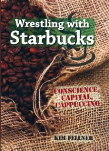 Kim Fellner's book
  A
A